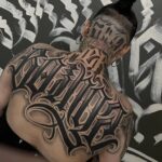
Cursive tattoo fonts range from restrained scripts like Alex Brush to theatrical flourished alphabets, and the deciding factor is usually how much maintenance you are willing to sign up for.
Thin upstroke families such as Aneisha Script demand perfect technique and age faster on high-friction spots, while thick downstroke styles like Beloved Script hold pigment deeper and weather into a readable version of themselves.
1. Beloved Script
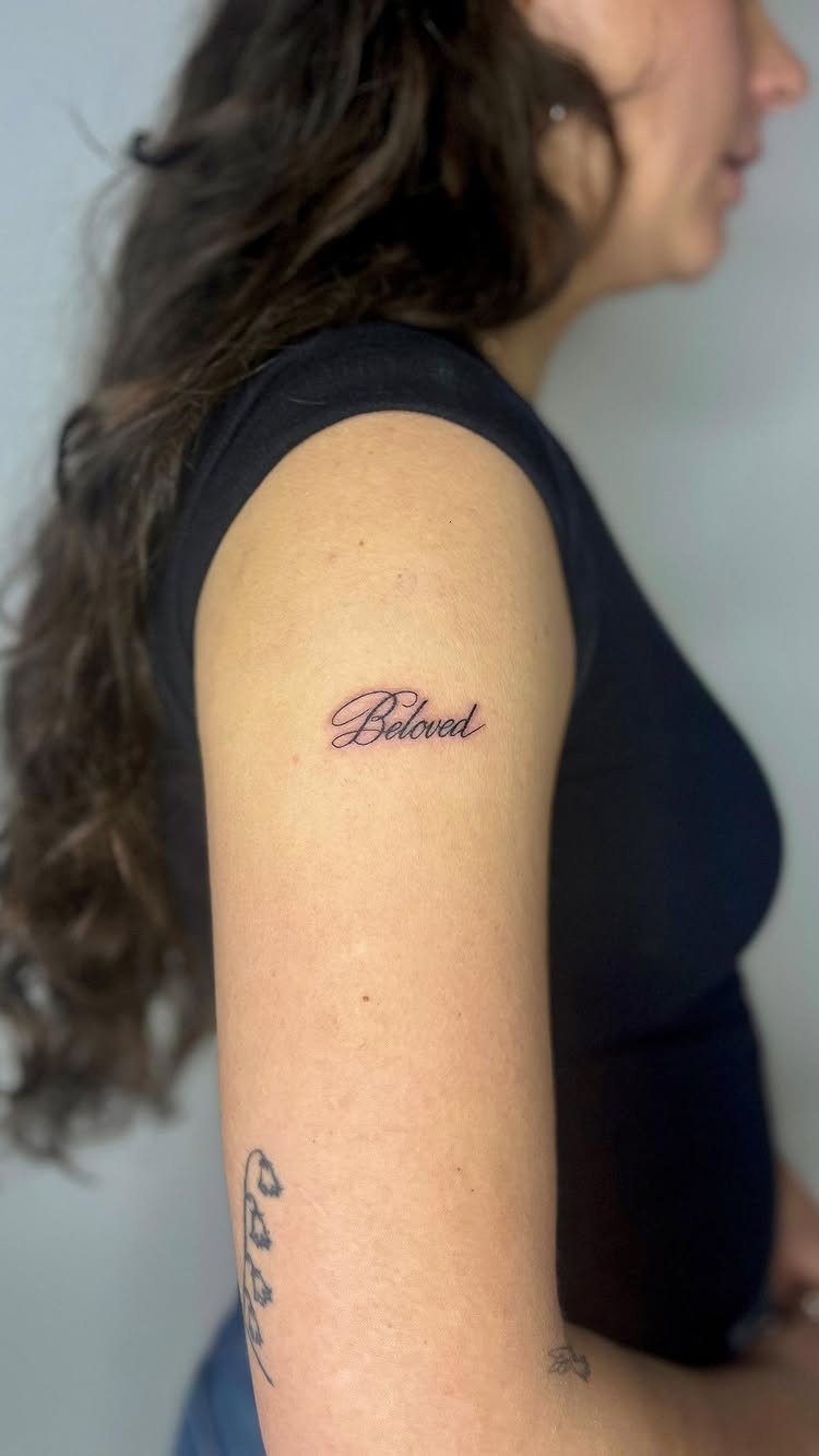
Beloved Script reads as a contemporary romantic typeface built for tattoo work, not a general font forced to fit. Regular and Bold weights give you real options, and the alternates solve spacing problems before you start drawing.
One lowercase connection pinches too tight on a curved placement like a bicep or shoulder; swap in another version that opens it up.
A capital letter tends to shout on a collarbone; lowercase usually settles in better there. This is the kind of family that earns its price for personalized work where free standards fall short.

Sexy Phrase Thigh Tattoo Design: This semi-permanent tattoo set highlights a handwritten-style phrase “Heaven Sent” designed for bold and expressive placement. The flowing script creates a natural, body-contouring effect that enhances curves, especially on thigh, hip, or waist. Perfect for women who love confident, sexy, and statement tattoos that express personality and attitude with a clean yet eye-catching style.

【Package Includes】: You will receive 65 pieces painting stencils totally, including 26 uppercase letters, 10 numbers, 26 lowercase letters, 4 styles symbol stencils. These will give you endless possibilities of customized words to create any DIY art projects as you like. More than that, all the characters have a stylish, calligraphic, cursive, and very pleasant font. (Stencils Font size: 2 inch).
2. Custom Lettering Tattoo
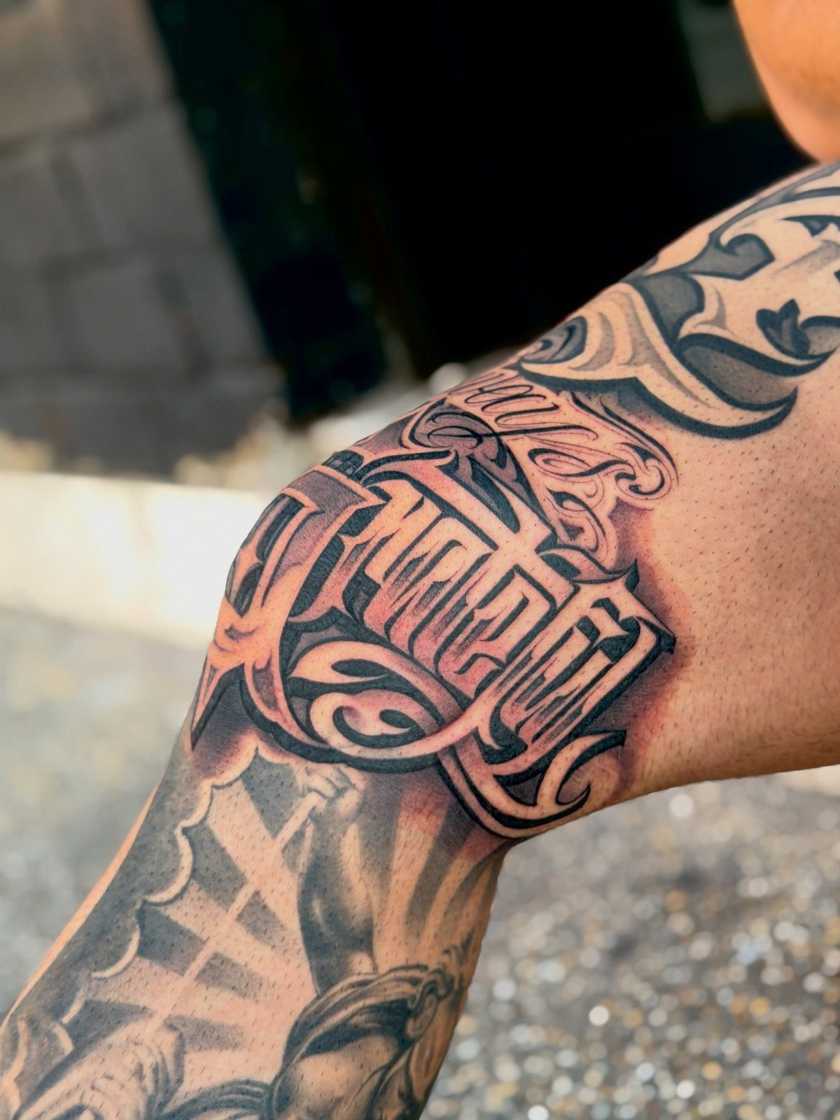
A good lettering artist builds the words to the body, not the other way around.
They will adjust stroke weight for your skin type, heavier on oily or darker skin that swallows fine lines, lighter where the dermis is thin over bone.
Serif fonts add small finishing strokes; sans-serif keeps detail low. Script joins letters and adds flourishes, which read beautifully fresh but blur over decades.
Before you lock in a design, run the same phrase through a few different font families side by side. Most shops can export your chosen text on a transparent background so you see how it wraps.
3. Moderate-to-Thick Strokes
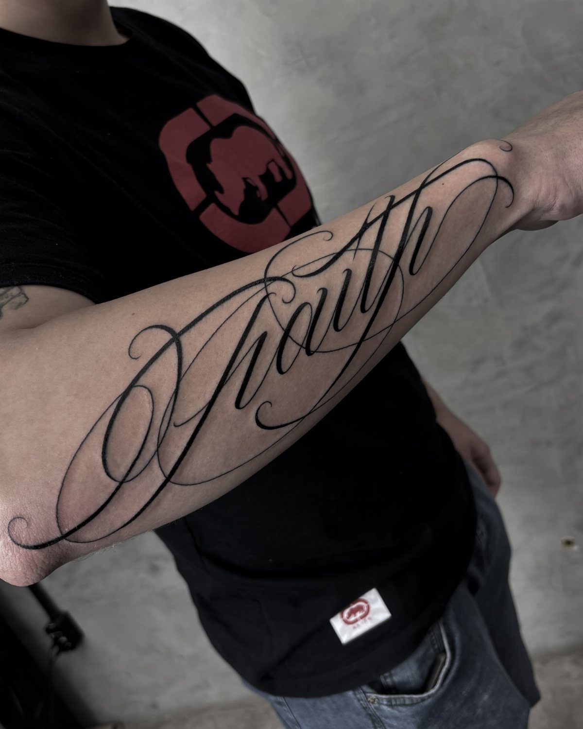
Thick downstrokes with controlled hairline flourishes give you the calligraphic look without the fragility. The weight carries pigment deep enough to hold, while excessive decorative loops trap ink at uneven depths and blur sooner than simpler strokes.
Ask your artist to keep the thin accents minimal and connect them with confidence; tentative lines heal patchy.
Serif and sans-serif fonts both work here, but script families with built-in stroke variation save you from relying on the artist’s freehand for the whole effect.
4. Alex Brush
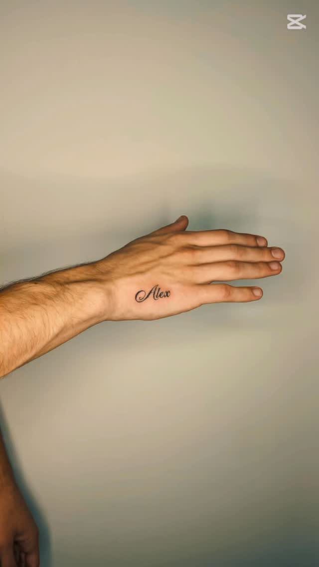
Alex Brush is the safe choice that still looks alive.
The flow feels hand-drawn rather than mechanical, and it cooperates with the small-to-medium spots where most script tattoos end up: wrist, forearm, ribs, collarbone. Those placements do not forgive busy lettering, and this font usually stays clean without turning clinical.
I would not reach for it if you want swagger or vintage personality; it is too polite for that. For a first script piece or a word that needs to read clearly at conversational distance, it earns its spot.
5. Lavanderia
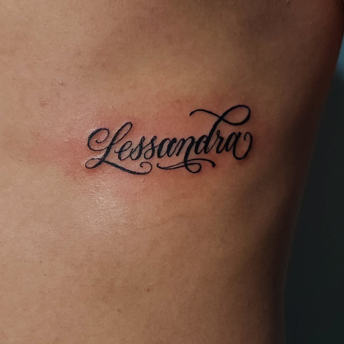
Lavanderia borrows from old sign-painting tradition, and you sense that right away.
The letters have swagger; they lean and push instead of sitting still. The varied stroke weights need a confident artist; thin spots must stay consistent or the whole word goes soft.
I would check their healed portfolio for similar scripts before booking. Extra weight options help if you need the same word scaled larger for a chest or thigh piece.

Texture of material: 70% nylon, 30% spandex (1 pcs)

★【16 Sheets Realistic Floral Proverb Words Temporary Tattoos For Women】--COKTAK Brand Vintage Black Mixed Style Proverb Words Tattoos. Package Includes 16 Sheets Realistic Waterproof Planet Lily Lotus Sunflower Rose Butterfly Floral Chains Tattoos Proverb Words Quotes Letters Tattoos Flower Chains Temporary Tattoo Stickers.

🌊【12 SHEETS Jesus Angel Temporary Tattoos For Women Men Adults】GOROMON Unique Design Waterproof Realistic Angel Tattoos Including 12 Sheets chicana Chicano Cholo Chola Christian Faith Prayer Religious Belief Holy Spirit Dove Pigeon Angel Jesus Tattoos Family Themed Engraved Letters Tattoos Gangster Robber Poker Bad Guy Women Face Chicano Temporary Tattoo Sticker.
6. Aneisha Script Cursive Tattoo Font
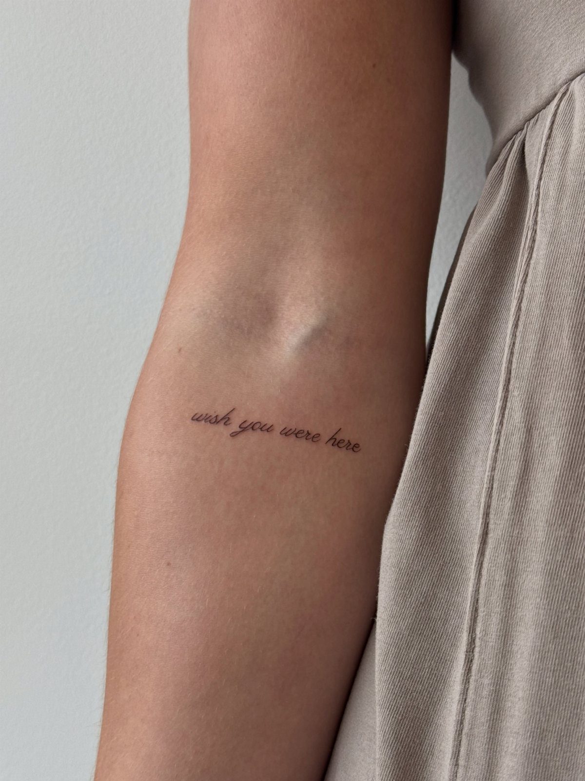
Aneisha Script lives in the expressive, high-contrast space: thin upstrokes, thick downstrokes, curves that carry emotion. The same family includes Charlotte Sweet and other variants, so you can keep a consistent mood across multiple tattoos or matching pieces for couples.
Thin tattoo fonts like this demand perfect technique; any wobble in the needle shows, and aging accelerates on the hairline passages.
I would save this one for short phrases and placement away from high-friction spots like the side of the hand or inner finger.

DURABLE TEMPORARY TATTOO: Made with skin-friendly materials designed for comfortable wear. These temporary tattoos typically last about 3–7 days depending on skin type and placement.

Realistic Finish: Different from you know ordinary temporary tattoo stickers or fake tattoos. It is so real and comparable to the real tattoo. It is a semi-permanent technology, Water-Resistant, friction-resistant, and can last for a long time, staying on your skin for 1-2 weeks.

DURABLE TEMPORARY TATTOO: Made with skin-friendly materials for comfortable wear and a clean appearance. These temporary tattoos typically remain visible for 3–7 days, depending on skin type, placement, and care.
7. Decorative Flourished Alphabet
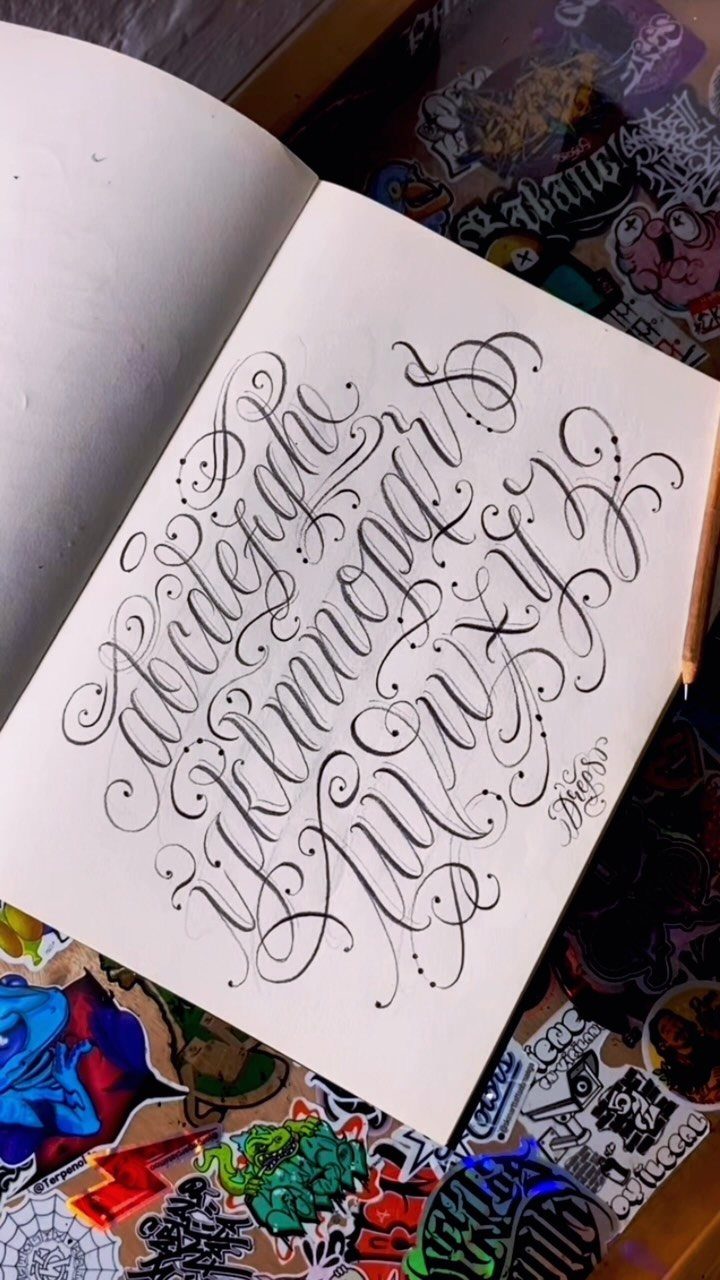
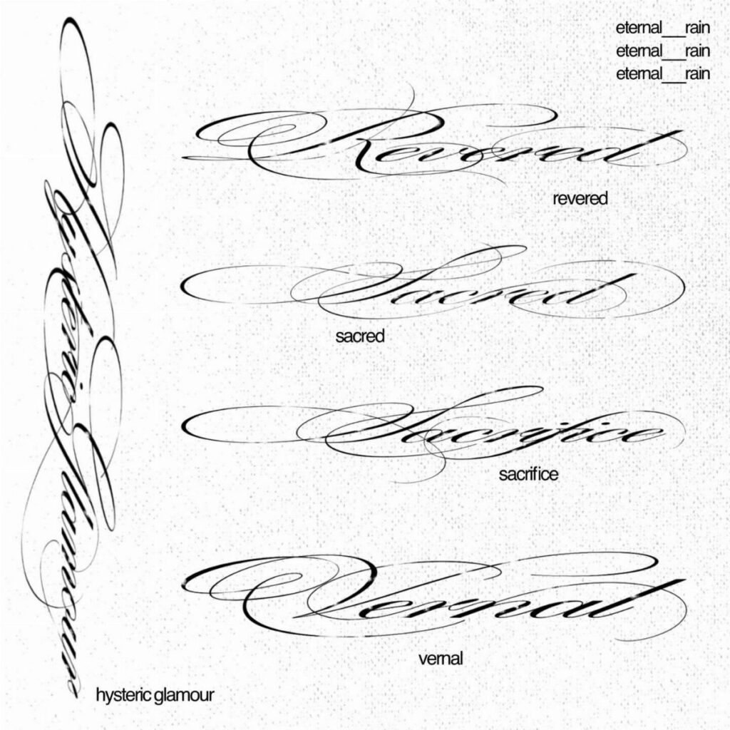
Dreps. built this alphabet as a practice sheet, not a finished tattoo, and that matters. The flourishes are generous enough that any single letter could anchor a small composition, but strung together they fight for space.
I would pull one letter as a standalone initial, or ask an artist to thin the loops by half for a full word. Check that your chosen artist draws flourishes from muscle memory; these shapes turn stiff when traced.

【Sexy Words & Butterfly Wings Design】This semi-permanent tattoos set combines elegant script words like “do for love” “kiss me” and romantic phrases with delicate butterfly wing elements. The designs balance typography with symbolic visuals, creating a trendy, expressive aesthetic. Perfect for women who love meaningful quotes and subtle sexy styles, especially for lower back or small placements that highlight personality and emotion.

FUN TATTOOS - Enjoy this fun sheet of temporary tattoos that can be applied on skin or used as a waterslide decal on a variety of surfaces. Temporary tattoos are great for party favors, events, costumes and dress-up, permanent tattoo testing or just for fun.

FUN TATTOOS - Enjoy this fun sheet of temporary tattoos that can be applied on skin or used as a waterslide decal on a variety of surfaces. Temporary tattoos are great for party favors, events, costumes and dress-up, permanent tattoo testing or just for fun.
8. Calligraphy Script Variations
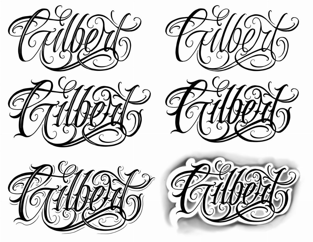
Seeing one name written several ways lets you compare how ornamentation changes readability. The plainest reads fastest; the busiest demands more distance to resolve.
Molly Suber Thorpe’s Cantaloupe Script works similarly, with 500-plus glyphs that let you tune the same word from restrained to theatrical. Samantha Calligraphy offers the same luxury in a cleaner register.
Both come at a price; free alternatives rarely carry the full character set. I would buy the font, export your phrase at actual size, and live with the printout a week before committing.
9. Script Tattoo with Heart Accents
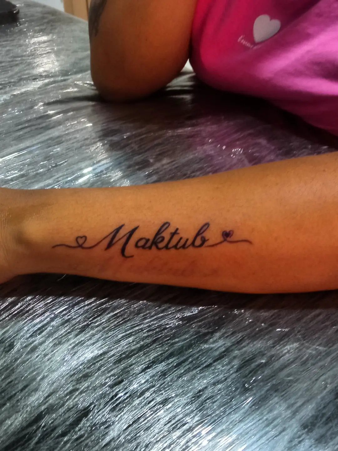
Small hearts bracketing a word add sentiment without rewriting the letterforms.
The symbols sit outside the main stroke, so they fade on their own schedule; plan for touch-ups or accept the mismatch. This style suits short words best.
"Maktub" is short; much longer and the hearts feel like bookends on a shelf too full. I would keep the hearts the same weight as the downstrokes, not lighter, or they disappear first.

DURABLE: Your tattoos will last upward of a week, sometimes longer if it isn't placed in a high friction area.


10. Side-of-Hand Cursive Script
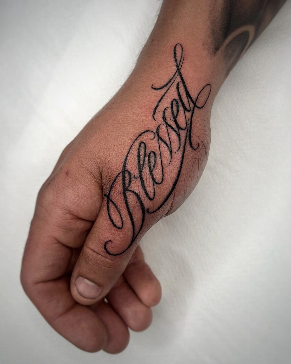
The side of the hand sees more abrasion and sun than almost any placement, and fine cursive is the worst choice for both.
A word like "Blessed" here is a commitment to maintenance, not a set-and-forget piece. Monoline scripts such as Cantaloupe hold up marginally better than hairline contrast styles, since even wear affects them more evenly.
I would still expect substantial fading sooner than most placements. Budget for refresh sessions from the start, or choose a spot with thicker skin.

🐙17 Sheets Unique Jesus Temporary Tattoos:🐠 There Are 17 Sheets Jesus And Angel Temporary Tattoos For Men Forearm Half Arm Sleeve Temporary Tattoos For Women Including Various Popular Designs Religious Belief Themed Family Christian Faith Letters Engraved Tattoos Jesus Angel Holy Spirit Dove Pigeon Temporary Tattoos For Adults.

🌼【VARIETY OF POPULAR PATTERNS】12 Sheets High Quality Mixed Style Realistic Forearm Temporary Tattoos For Half Arm Sleeve Including Various Family First Themed Lion Tiger Sword Hope Holy Spirit Dove Pigeon Pray Angel Cross Eye Rose Compass Clock Lettering Lettering Carved Tattoos Half Arm Temporary Tattoos For Women Men.

【Style and Elements】 2 sheets different sizes temporary tattoos including alphabet, script, piano, notes, portrait, cross, crown, heart, skull, digital, tree, geometric patterns and more.
11. Sweeping Forearm Script Tattoo
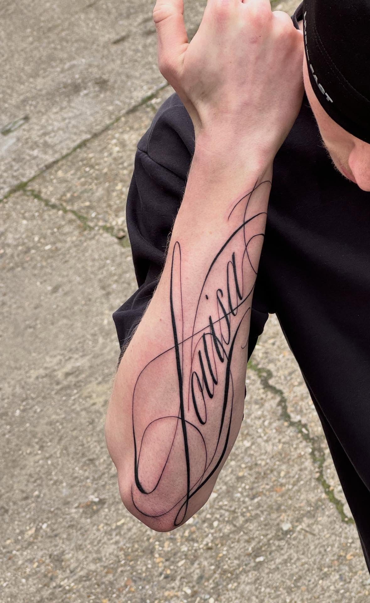
A name sweeping toward the elbow uses the forearm’s length instead of fighting it.
Classic American Script from the 1950s builds this look with thick downstrokes and thinner upstrokes; the style still reads at distance and ages into a weathered version of itself rather than a blur.
Old School Swirls add loops that work for names, though I would keep them below the word, not above, to avoid the elbow crease. Lobster-style runs more playful; save it for a nickname, not a legal name you might outgrow.
Choosing the Right Font
A word you carry for decades needs to feel right on day one and year twenty.
Script fonts read personal because they borrow from handwriting, but that same warmth can turn mushy if the emotion behind the phrase overwhelms the letterforms.
I would test a font’s staying power by printing the phrase at actual size and pinning it where I see it daily; irritation in week two means regret in year ten.
Placement changes how a font behaves.
A bicep curves and flexes, so letters compress and stretch; a collarbone stays flatter but offers less width. Compare simple and script versions side by side before you settle; the plain one often lasts longer in memory.
Check every spelling, date, and accent yourself.
Tattoo artists are not proofreaders, and a saved PNG becomes your reference for line width and final placement. Confirm both with the artist before the needle starts.
Tattoo Design Tips
Freestyle lettering from an experienced artist gives you a one-of-a-kind piece, but it costs more and takes longer to design.
A font family you buy lets you preview exactly how your phrase looks, while custom work evolves through draft and revision, so you trade control for collaboration.
Ask the artist how the font’s stroke weight matches your skin and the overall theme.
Thicker downstrokes hold pigment deeper; hairline flourishes need perfect technique or they heal patchy. Either way, the lettering should serve the meaning, not compete with it.
Use that file to see how the word wraps around your actual body part, not a flat screen. What reads clean on a monitor may tangle on a forearm curve.
Font Licensing
Fonts you download for free usually carry a personal-use license only. That covers your computer, not a commercial tattoo applied to skin by an artist running a business.
I would check the license terms before bringing any file to a shop; the foundry’s site or the download page states the boundary clearly.
Paid platforms like Adobe Fonts bundle commercial rights with the subscription, though the license may still exclude certain uses. Read the specific terms; "commercial" in software licensing does not always mean "tattoo studio."
When in doubt, buy a desktop license directly from the type designer. Single fonts cost less than the total price of the tattoo, and checking the license beforehand keeps you out of legal trouble later.
The artist needs a usable file format, usually PNG for reference or vector for stencil work.
A font you cannot export cleanly at high resolution costs you nothing and gains you nothing. Test the export before you pay.
Frequently Asked Questions
What fonts go with cursive?
Serif and sans-serif fonts pair well with cursive for contrast.
In tattoo work, that contrast helps the script stand out without competing against another decorative style. I would avoid pairing 2 cursive fonts together; both fight for attention and the piece turns muddy.
What is the fancy tattoo font called?
Decorative scripts like Aneisha Script or Lavanderia carry the fancy label in tattoo work, with high-contrast strokes and flourished letterforms. Bickham Script Pro also gets mentioned for ornate tattoo lettering.
What font is the best for tattoos?
The best font depends on your skin type, placement, and how long you need it to read clearly.
Script fonts remain popular because they borrow from handwriting and feel personal, but thick downstrokes with minimal hairline flourishes usually outlast busy decorative work.
I tape the design to my bathroom mirror at the size it will actually sit on skin and give it seven days; if I am tired of reading it by day three, the answer is no.