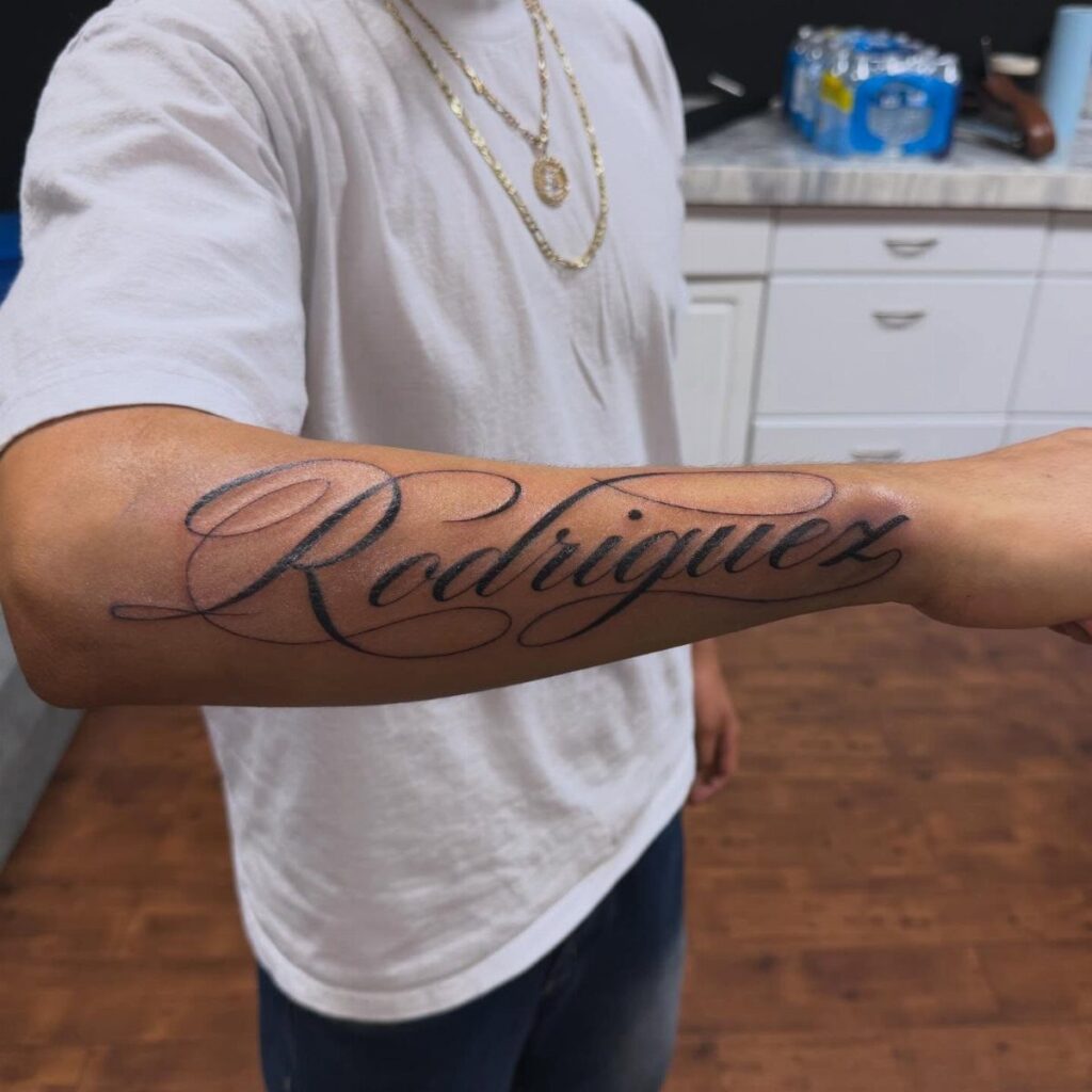
These 8 forearm cursive tattoos run from a single word to a phrase long enough to fill the inner forearm, and the deciding factor is how much skin you are willing to give the ink versus how much meaning you need it to carry.
A one-word piece like "Blessed" lives on its flourishes, while "In God’s Hands" demands consistent letter spacing across the full length to stay readable, and the same holds for "Godspeed," "Nostalgia," "Resilience," and the longer phrases like "Love Yours" that need room to breathe.
1. Blessed
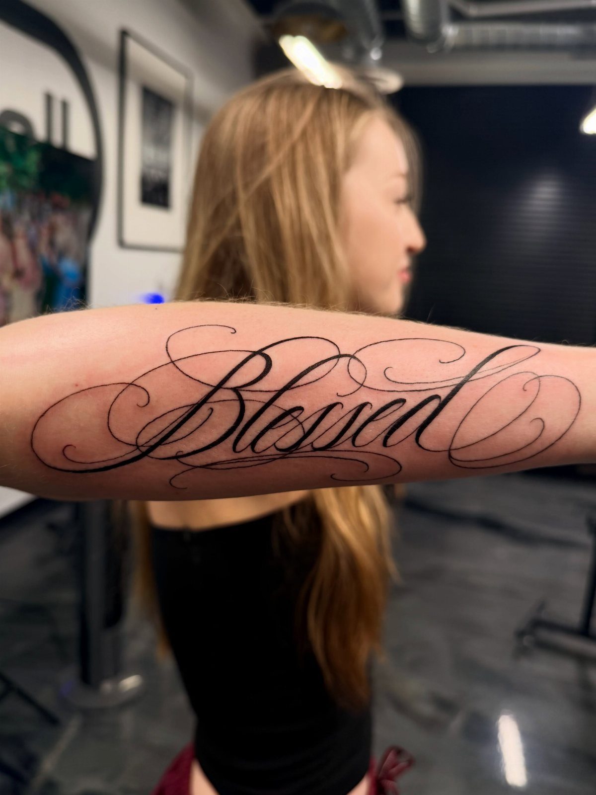
A single word can carry the weight of a whole philosophy, and "Blessed" does it without preaching.
The long flourishes suit someone who wants the ink to read as handwriting rather than typeset, with the tails and swashes filling space the way a larger phrase would.
The decorative line work needs a forearm with enough real estate to let the thin strokes breathe; crowding it onto a wrist would lose the sweep that makes the style work. Black ink keeps the focus on the letterforms themselves.
Ask your artist to draw the extended tails first, before the word, so you see how the flourishes sit against your muscle line when the arm rests naturally.

1 Set = 12 Sheets Henna Tattoo Stencils, 6 Pairs Right and Left hands stencils. Pasting position: Hand, Finger,Forearm, etc. Suitable for Henna tattoo, Airbrush Painting, Glitter tattoo, and so on;

Premium Quality 1.5mm Silicone Material – Crafted from premium 1.5mm thick silicone, this tattoo skin offers a true-to-life feel with excellent durability and a smooth surface for effortless needle movement during practice.
2. Godspeed
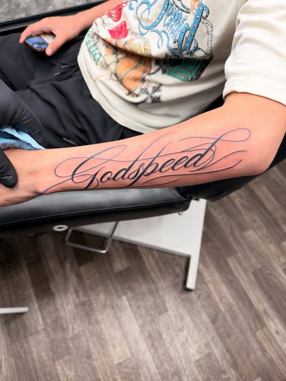
Godspeed carries a farewell and a blessing in a single word, which is why it lands harder than longer quotes that try to say the same thing.
The inner forearm placement puts it where you can read it yourself, not where it performs for others.
The extended flourishes need attention to line weight; too thin and they fade within a couple of years, too heavy and the word loses its elegance.
Most artists build this with a single needle for the hairlines and switch to a three for the downstrokes.
This one reads masculine without being aggressive, which is a narrower target than it sounds. If you are after something gender-neutral, the same script in a rounder hand works without changing the word.

Crystal Clear Transfer & Stable Stencil Effect : Our KVM transparent tattoo stencil film delivers sharp, clean printed lines. The pattern transfers perfectly onto skin, not easy to smudge or wipe off after application. It works great for intricate mandalas, skulls, portraits and line art.
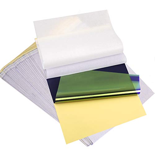
ADVANCED MATERIAL: Tattoo transfer paper is made with the high quality dyes and stencil paper. Transfer marks are very clear, clean and smooth. Tattoo transfer paper kit come with 35 sheets. Great for tattooing, trace and transfer images onto the body.<br>

Warm Tips: The tattoo transfer paper need to work with transfer medias.You will need to purchase the stencil ointment separately. Apply the design made on the master paper. Please pay attention to press the back side of the pattern to the skin for at least 3 seconds
3. Nostalgia
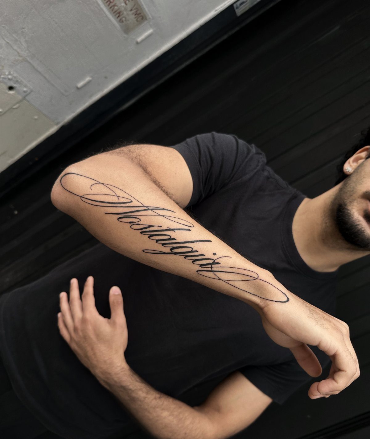
"Nostalgia" is the rare word that names its own risk; the tattoo itself may become the object of nostalgia, which is either poetic or a warning depending on your mood.
The curve of the forearm guides the letterforms here, with the flourishes following the natural arc rather than fighting it.
That alignment matters more than it looks.
A straight baseline on a curved surface reads wrong from every angle except one, and that angle is never the one you are standing in. Let the script flow with the body, not across it.
This is a word that ages oddly: the sentiment deepens, but the specific memory it pointed to may blur. Choose it for the feeling, not the event.
PACKAGE CONTENTS: There are 3 packs black temporary tattoo ink, 103 patterns tattoo stencils and one pin included in this comprehensive kit

PACKAGE CONTENTS: There are 4 packs black temporary tattoo ink, 103 patterns tattoo stencils and one pin included in this comprehensive kit
100+ Pre-Printed Designs – Features a wide variety of fine line and tiny tattoo stencils to enhance detailing skills.
4. Resilience
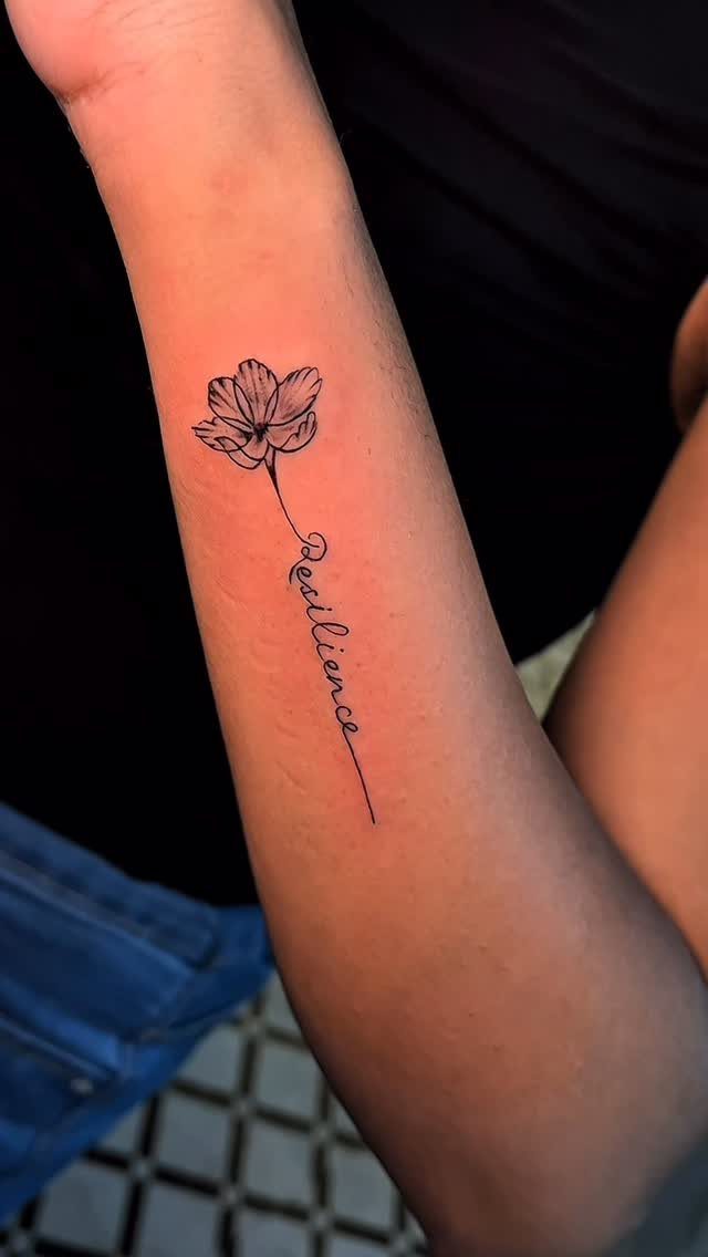
The stem forming the word means the design works as botany first and text second, which softens the declarative tone that "Resilience" can carry on its own.
Fine-line flower work needs an artist who specializes in it; the stem that becomes lettering is not a trick every hand can manage cleanly.
Ask to see healed photos of similar integrations, not fresh ones, because the thin connecting lines are where blowout shows first.
The inner forearm placement puts the flower where sleeves hide it and short sleeves reveal it, which is a useful control over who sees the word and when.

GUIDED DESIGNS FOR FOCUSED PRACTICE: Five thick patterned tattoo skin give beginners clear visual references for outlining, curves, corners and detail work. Tiger, dragon, skull, rose and lotus artwork helps vary each session instead of repeating one simple motif
3MM Tiny Tattoo Practice skin Made from high-quality materials, it is closely mimic the texture and feel of real human skin. This gives you a realistic experience, allowing you to refine your skills before working on actual clients

⚡️Premium Practice Kit : No more separate purchases! Get 10 reusable silicone tattoo practice skins (7.4"x5.6") and 20 professional stencil papers (11"x8.5") – A complete bundle to master techniques without wasting supplies. Perfect for tattoo artists & apprentices!
5. Love Yours
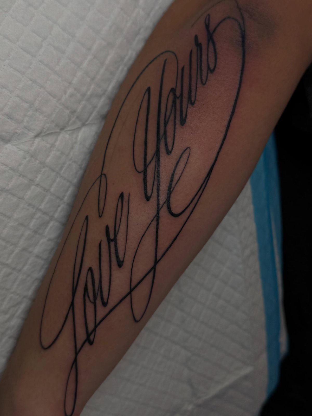
"Love Yours" works because it is instruction and affirmation at once, and the diagonal flow keeps it from reading as a bumper sticker.
The elongated flourishing lines stretch the 2 words across the same space a longer phrase would need, so you get impact without verbosity.
Fine-line script this extended needs spacing discipline; the flourishes must connect or relate to the letterforms, not float as decoration. A good artist will sketch this on you standing, since the forearm changes dimensionally between rest and extension.
The phrase suits someone past the first tattoo, when you know how ink sits on your particular skin tone and how your body heals. First-timers often underestimate how much a diagonal placement moves with gesture.

24PCS Unique Henna Stencil Pack – This complete henna tattoo kit accessory set includes 24 sheets of reusable mehndi stencils (6.89" x 3.34"). Featuring exclusive designs like long arm bands, moon motifs, vine flowers, and large floral templates, it is ideal for creating DIY temporary skin art on wrists, arms, back, and full body.

【 575+ Fun Assorted Tattoo Stencils 】-The ChurlChurl tattoo stencils collection includes 575 high quality stencils with multiple themes. enjoy cute trendy tattoo stencil designs like butterflies, words, flowers, symbols, totem, Egypt style patterns and more.

1 Set = 12 Sheets Henna Tattoo Stencils, 6 Pairs Right and Left hands stencils. Pasting position: Hand, Finger,Forearm, etc. Suitable for Henna tattoo, Airbrush Painting, Glitter tattoo, and so on;
6. Cursive Calligraphy Across Forearm and Hand
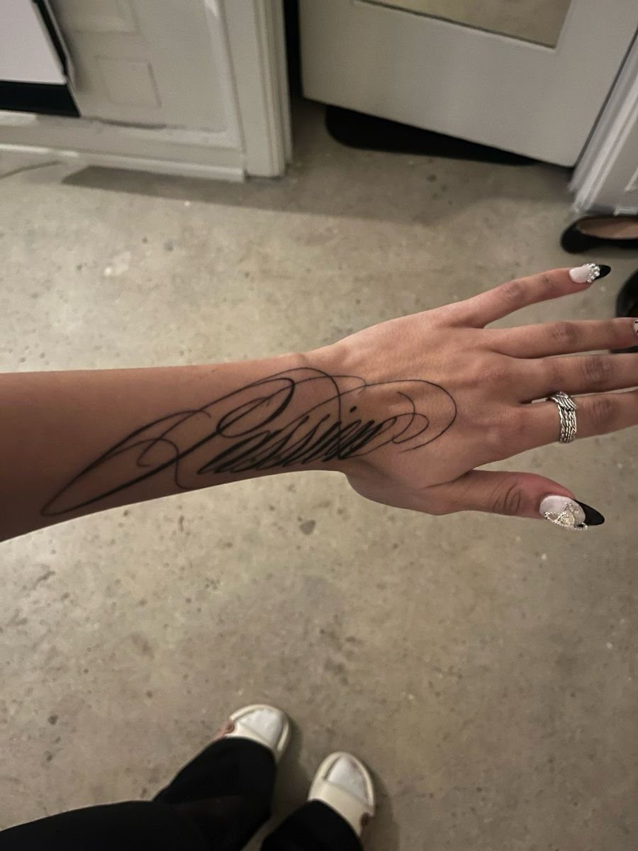
The forearm-to-hand extension is the hardest placement to commit to and the hardest to undo; the hand is visible, the healing is awkward, and touch-ups are nearly guaranteed.
That said, the continuity of script flowing from arm to hand has no equivalent in smaller placements, and the custom lettering means no one else carries your version.
The composition was designed for this specific movement, which is the only way it works; generic script dragged across a joint looks like an accident.
The artist needs to map the letterforms with your hand both flat and gripping, since the skin tension changes dramatically.
Bali or not, the principle is the same: the design must account for how you actually use your hands, not how they look in a photograph.

Precision Transfers & Long Lasting: Tattoo stencil paper delivers vibrant, high-definition transfers even for intricate designs. Creates crisp, dark lines that transfer cleanly to skin (clearly on different skin tones) which are easy to follow during tattooing. The carbon layer made from high-quality dyes ensures sharp outlines without smudging or fading and maintains crisp lines visibility throughout long tattoo sessions, so you can focus on creating art instead of re-drawing lines

WORMHLE PRO Tattoo Transfer Paper: Quantity: 1 Box, 35 Sheets in the box, Color: Pink. WORMHLE PRO Tattoo Transfer Paper is compatible with mini tattoo stencil printer

Precision Transfer Performance - It’s professional-grade tattoo stencil paper delivers vibrant, high-definition transfers even for intricate designs. The carbon layer ensures sharp outlines without smudging or fading, ensuring crisp lines that stay true to your original artwork.
7. In God’s Hands Script
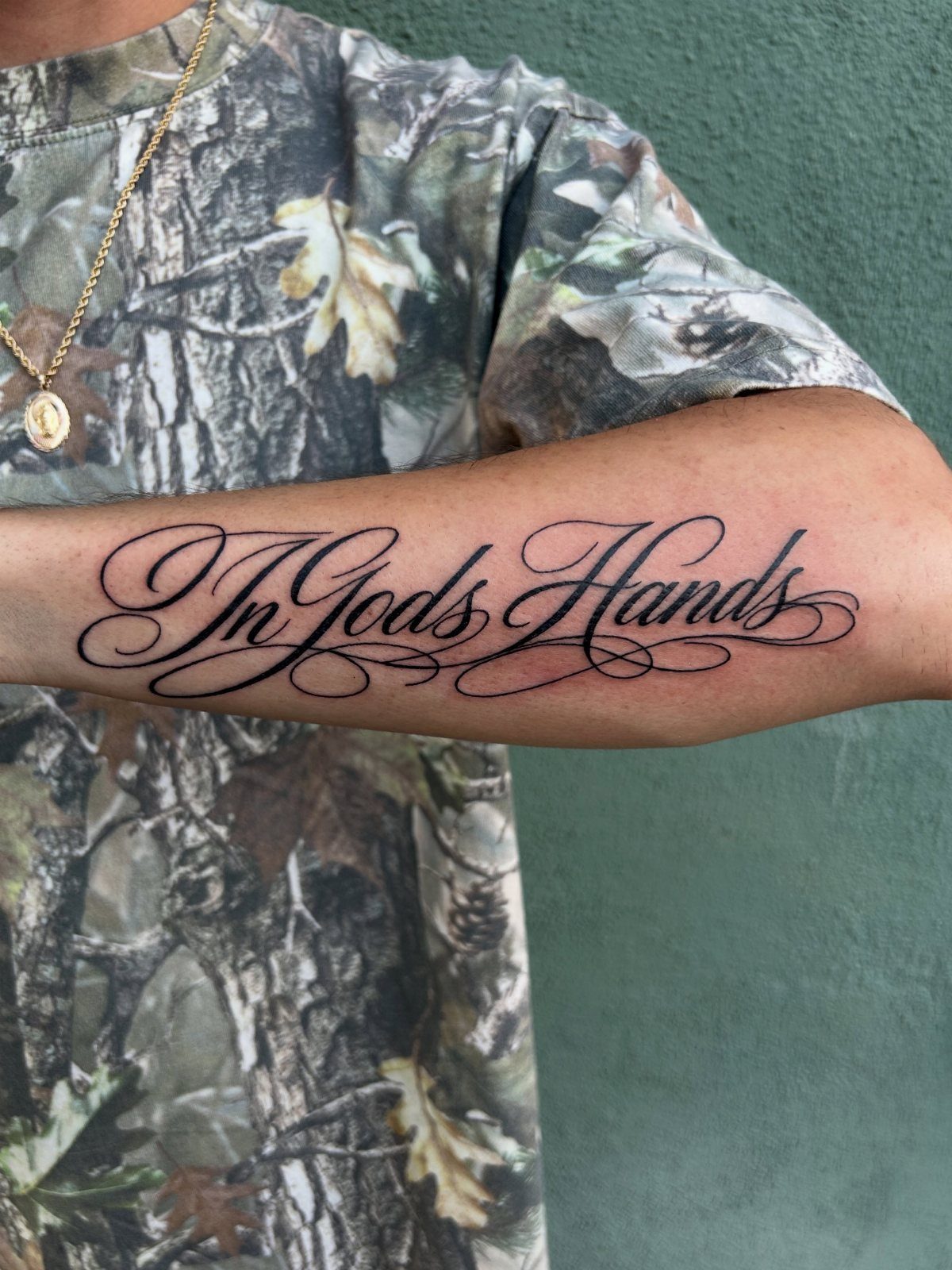
The phrase fills the inner forearm with a confidence that shorter words do not carry, the words stretching to claim their space without crowding.
The script is readable first and decorative second, which matters for a phrase this long; illegible cursive here would waste the meaning entirely.
The straight baseline works on the inner forearm because the surface is flatter than the outer curve, so the text does not distort when the arm hangs naturally.
Black ink alone ages more predictably and needs no touch-up schedule, which is why I still recommend it for script that needs to stay readable decades out.
Check that your artist can keep letter spacing consistent across the whole phrase; uneven tightening at the end is the common flaw in forearm script this long.

[Tattoo Supplies with Complete Accessories] This complete tattoo machine kit includes 1 wireless pen machine, 20 needles, 1 black ink, 3 practice skins and essential accessories—ideal for beginners and artists seeking a maquina para tatuar

- Complete Tattoo Kit: This cordless tattoo kit includes 73 pieces, featuring a compact aluminum alloy tattoo gun, high-quality tattoo ink, 20pcs tattoo cartridge needles, and essential accessories for both beginners and seasoned artists. Enjoy everything you need in this tattoo kit

All-in-One Beginner Tattoo Station: Designed specifically for practice and skill development, this Wormhole Tattoo Kit for beginners; You get everything needed to start practicing immediately: 1 Ergonomic Rotary Tattoo Pen, 20 Cartridge Needles, 10 Practice Inks, Reusable Practice Skins, Transfer Paper, Ink Caps, and a Reliable Power Supply with Foot Pedal
8. Delicate Name with Botanical Accents
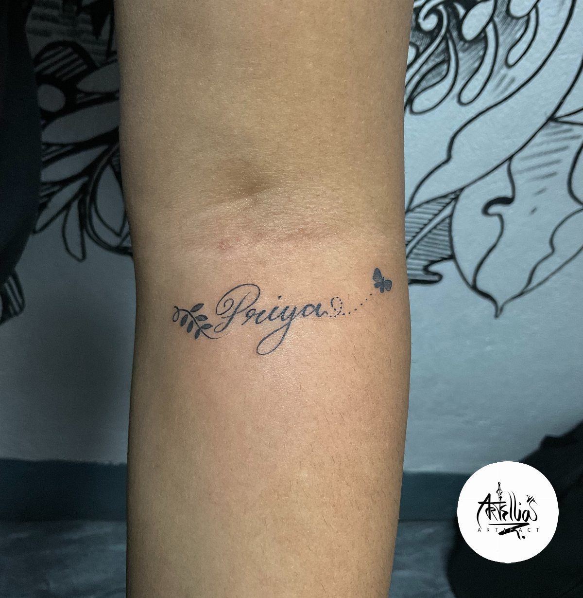
A name tattoo gains permission to stay small when it carries a living thing beside it, the leaf and butterfly telling the eye this is a garden reference, not a claim on a person.
The fine-line weight suits the inner forearm where skin stays relatively stable, though the butterfly’s thin antennae are the first detail to soften with age.
The vertical placement on a wrist, seen elsewhere for names this size, reads as jewelry; this horizontal forearm version reads as text you chose to place, which is a different statement.
The leaf sprig anchors the name spatially, so the eye knows where the word ends and the decoration begins.
Ask your artist to draw the botanicals at final needle size, not pencil, since fine-line ink spreads differently than graphite suggests.

📦【Complete Tattoo Practice Kit】 Includes 5 pieces of tattoo practice skin (5.5" x 7.5") and 20 sheets of tattoo transfer paper (A4 size), providing everything you need to create, transfer, and practice tattoo designs. A convenient tattoo supplies bundle for beginners, apprentices, and professional artists.

Complete Starter Tattoo Kit: Includes an aluminum alloy rotary tattoo pen, power supply, foot pedal, RCA cord, 20 cartridge needles, 8 bottles of 30ml ink, 2 transfer papers, practice skin, 40 ink caps, grip cover, gloves

【Package and Size】 - Package include 5Pcs 7.4*5.6 inch Blank Tattoo Practice Skin and 15Pcs 11*8.5 inch Stencil Paper. The value combination suitable for beginners and experienced artists. Both sides of each tattoo skin are blank, providing enough space for your masterpiece creation.
Tattoo Placement Tips
The outer forearm reads as display, the kind of placement that starts conversations with strangers; choose based on whose eyes you want the work to reach.
Muscle definition changes how script sits.
A flat inner surface keeps baselines level, while the outer curve can make straight lettering bow unless the artist accounts for the swell. Ask them to mark the design with your arm hanging loose, not flexed on a table.

183PCS Different Styles Tattoos Stencil: Our temporary tattoo stencils forkids comes with 183 temporary tattoo stencils painting set design such as flowers, cats, hearts, skulls, dinosaurs, fruits, deer, scorpions, Hannah, unicorns, whales, cars, rainbows, telescopes, ships, too fast, astronauts, pirates, letters, stars and more Style in 12 sheets A5 size. Perfect for festivals, parties, or daily fashion.

✨ Jumbo 6-Sheet Collection: Each set includes 6 large A4 sheets featuring dozens of unique henna stencils and mehndi stencils for hands. From henna stencils flowers to bold tattoo stencils premade, this bulk kit offers endless variety for body paint.

Package: Only 14 Sheets 3 layers PVC henna hand stencils, Washable and Non-Toxic. Ink is not included
Design Considerations
Cursive that flows with the forearm’s length looks intentional; cursive that cuts across it looks applied.
The diagonal placement in some men’s work follows the arm’s natural geometry, while the horizontal flow common in women’s lettering traces the bone line. Neither is wrong, but the choice should be deliberate.
Skin tension differs by spot. Thin lines age differently on the inner forearm near the elbow crease than on the outer surface near the wrist, since that inner spot sees more stretch and fold.
A design extending toward the hand crosses into higher-movement territory; the lettering there blurs faster and touch-ups are not optional, they are scheduled maintenance.

【100pcs Tattoo Stencil Paper Kit】Tattoo Stencil Paper kit come with 100 sheets tattoo stencil paper. 4 Layers of transfer paper includes the master sheet, transparant protective sheet, blue carbon sheet and yellow backing sheet, size approx. 8 1/4" x 11 3/4" which can be cut down into smaller sheets for more use.

Sexy Phrase Thigh Tattoo Design: This semi-permanent tattoo set highlights a handwritten-style phrase “Heaven Sent” designed for bold and expressive placement. The flowing script creates a natural, body-contouring effect that enhances curves, especially on thigh, hip, or waist. Perfect for women who love confident, sexy, and statement tattoos that express personality and attitude with a clean yet eye-catching style.

📦【PACKAGE CONTENTS】 - This set includes 50 sheets of A4 size tattoo transfer paper, measuring 8.27 x 11.69 inches. Ideal for professional tattoo supplies and daily use.
Tattoo Styles
Fine-line cursive lives or dies by needle discipline.
A single pass at too shallow a depth falls out; too deep and the line feathers. The technique has matured enough that specialists now distinguish themselves by how their work heals at one year, not how it photographs fresh.
The aesthetic trades longevity for delicacy.
A bold traditional script holds for decades with minimal change; fine-line lettering softens and requires a maintenance mindset. Some artists now build this into the initial consultation, setting expectations for a touch-up timeline rather than treating it as failure.
Frequently Asked Questions
What do you call a full forearm tattoo?
A full forearm tattoo is usually called a sleeve, though a true sleeve runs from shoulder to wrist. A forearm-only piece is sometimes called a half sleeve or a forearm sleeve, depending on how far it wraps.
A full forearm tattoo is usually called a sleeve tattoo. The cursive designs here are mostly single words or short phrases that sit on part of the forearm rather than covering it entirely.
How big is a $2000 tattoo?
At most shops, that kind of budget buys you a half sleeve or a substantial forearm piece, maybe several sessions of work at current rates.
The fine-line cursive tattoos here, single words with flourishes, run far less, with price hinging on the artist and city. The difference is in the time on skin and the detail density, not just the square inches.
What is the 1/3 rule tattoo?
The 1/3 rule means the tattoo should take up about one-third of the body part it sits on, leaving enough skin around it to let the design breathe.
On a forearm, that keeps a word or phrase from looking stamped on or lost in too much empty space.
The cursive placements here, horizontal or diagonal across the inner or outer forearm, follow this more by instinct than by measurement, but the principle holds: the lettering needs margin to read as deliberate.