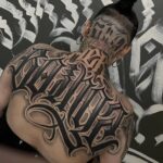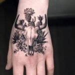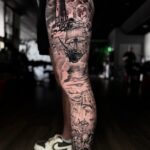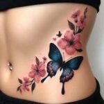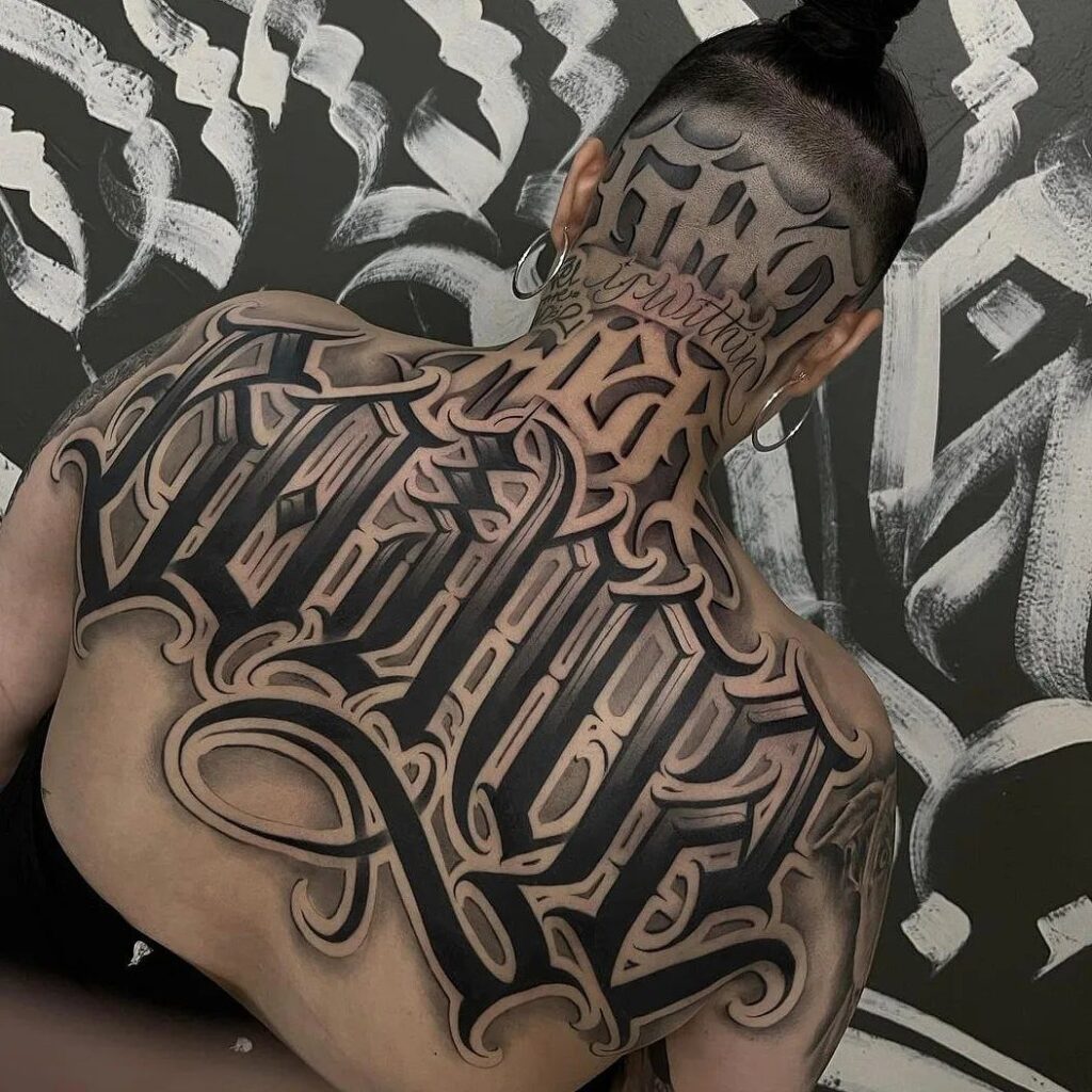
Back tattoo writing can run horizontal between the shoulders, drop vertical down the spine, sit fine-line and quiet at the nape, or pool in swirls low at the waist, and what settles the choice is how much your skin moves where you want it and how much of that movement you are willing to plan around.
The upper back offers the steadiest ground for script because the skin between the shoulder blades barely shifts when you breathe, though the spine itself is a different job, each vertebra a small hill the needle has to climb while you hold still.
1. Cursive Lettering
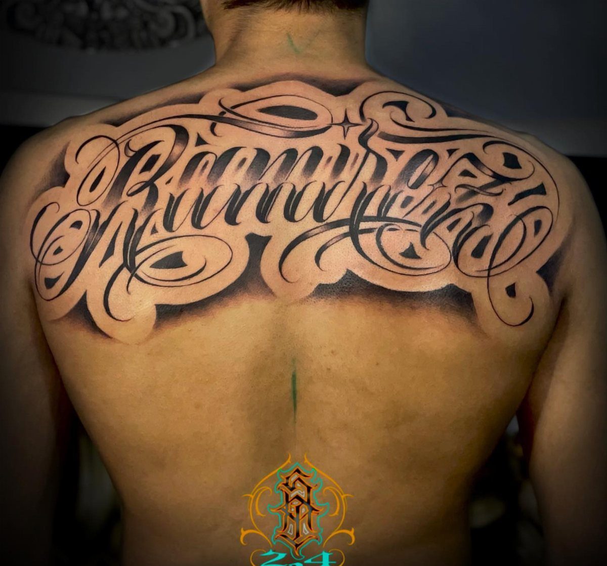
Cursive lettering on the back carries the eye across skin the way handwriting carries it across a page, except the body gives curves the paper never could.
A phrase running shoulder to shoulder means the artist has to account for how the skin stretches when you reach or slouch.
I would ask to see the stencil with my arms relaxed at my sides, then raised halfway, before any needle touches me.
Black ink holds up longest in script this ornate; color in cursive this thin tends to blur faster than you might expect.

Clean, Flawless Transfers: Your artwork will look so clean once transferred to the skin with the Stencil Stuff gel! Gentle on the skin, Stencil Stuff transfer solution helps you achieve clear and sharp tattoo stencil transfers every time!

24PCS Unique Henna Stencil Pack – This complete henna tattoo kit accessory set includes 24 sheets of reusable mehndi stencils (6.89" x 3.34"). Featuring exclusive designs like long arm bands, moon motifs, vine flowers, and large floral templates, it is ideal for creating DIY temporary skin art on wrists, arms, back, and full body.

Product Kits: You will receive 12 A4 sheets featuring 142 unique henna tattoo stencils patterns including butterflies, flowers, words, symbols, totems and egyptian designs. Our versatile temporary tattoos adult with stencils collection offers something for every taste with its wide variety of artistic models.
2. Vertical Text Along the Spine
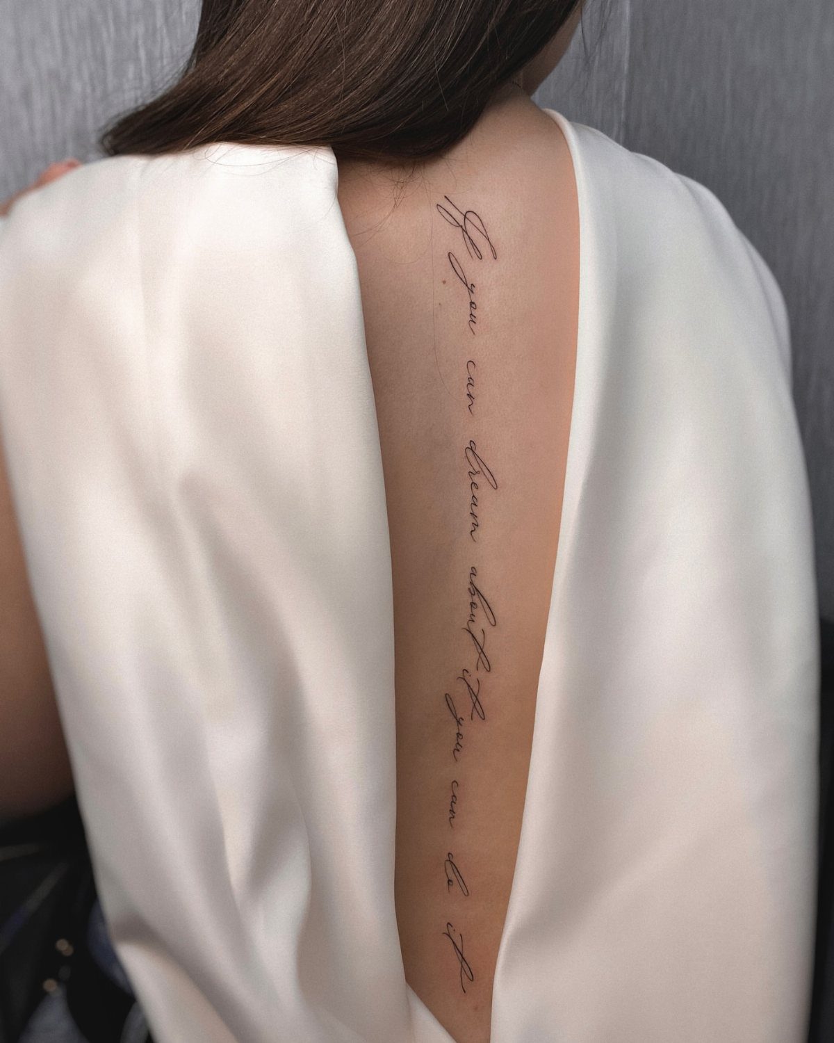
A vertical line down the spine turns your back into a column someone reads top to bottom, the way old manuscripts were read before the printing press.
The spine moves constantly, so the artist works in short sessions to keep the line straight as you shift. Fine line cursive is the usual choice here because heavy ink can spread along that mobile skin.
I have seen this placement on people who want the text hidden by a shirt collar for work, visible in a backless dress after hours.
The length of your phrase sets the starting point; a short quote begins higher, a long one can run from nape to waist.

Massive Quantity: 60 Sheets in total of fake temporary tattoo stickers, including 30 sheets of inspirational and motivational quotes and scripts, cursive words, retro typewriter style sayinging, 30 sheets of simple branch flower tattoos. Enough for friends party gatherings to enjoy together or choose different pattern to match your everyday mood.

CLEAN GIRL AESTHETIC WORDS: Features 5 expansive sheets packing over 50+ dainty, hand-written style inspirational words temporary tattoos, motivational quotes, and poetic phrases. Designed with beautiful cursive script temporary tattoos and minimalist typography to deliver that effortless, high-end fine-line ink look on your skin.

Innovative Skin-Sync Technology: We don't just sit on the skin; we interact with it. By reacting organically with naturally occurring proteins in your skin's outermost layer (stratum corneum), our plant-based formula magically transforms from a transparent guide into a rich, ultra-realistic navy-black. It looks exactly like a healed, permanent tattoo—without the needles or depth.
3. Horizontal Text Across the Back
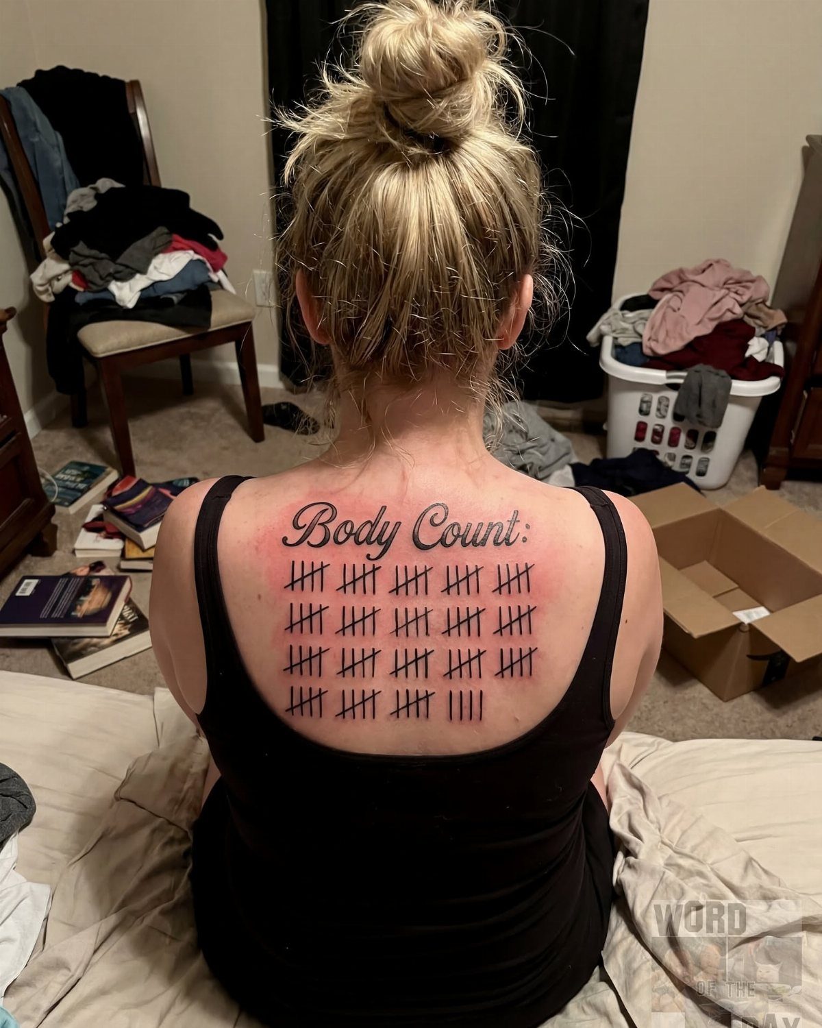
Horizontal text across the back reads like a banner, which makes it natural for lists, counts, or phrases you want faced head-on.
Tally marks beneath words only work with space to spread; measure your shoulder width against the design before you commit.
This placement sits where a bra strap or tank top edge might rub during healing, so plan your wardrobe around loose layers for the full healing stretch.

Saving Paper & Cut Down Consumable Costs: Featured with a compact 2.2 x 3.1 inch printing area, which equals 1/8 of a standard A4 tattoo transfer paper. Avoid unnecessary paper waste when printing small tattoo patterns, greatly improve paper utilization and effectively reduce your daily operating expenses
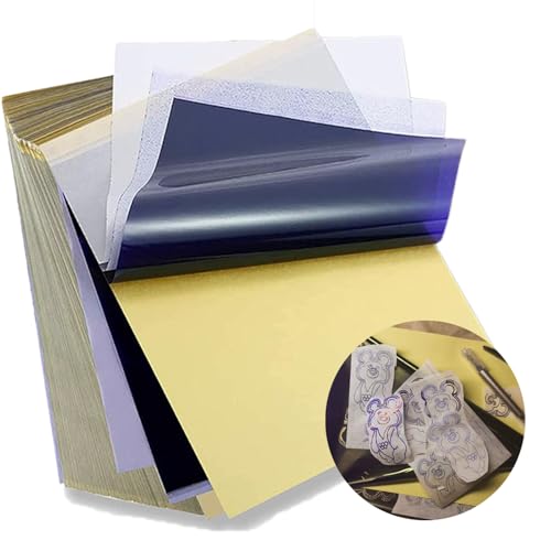
Standard size: Tattoo Transfer Paper is standard A4 paper size, each measures 8.27 in X 11.69 in. There are 4 levels in total. The thickness of the paper is very light and smooth to the touch.

★ FAVORED BY PROFESSIONALS: Be original, make your own semi-permanent tattoos. Our laser water slide decal paper is used around the world by professionals and businesses.Print tattoos effortlessly using our skin safe temporary tattoo transfer paper and make great long lasting and waterproof temporary tattoos with zero skin irritation when following the simple instructions provided.
4. Lettering with Swirls, Stars
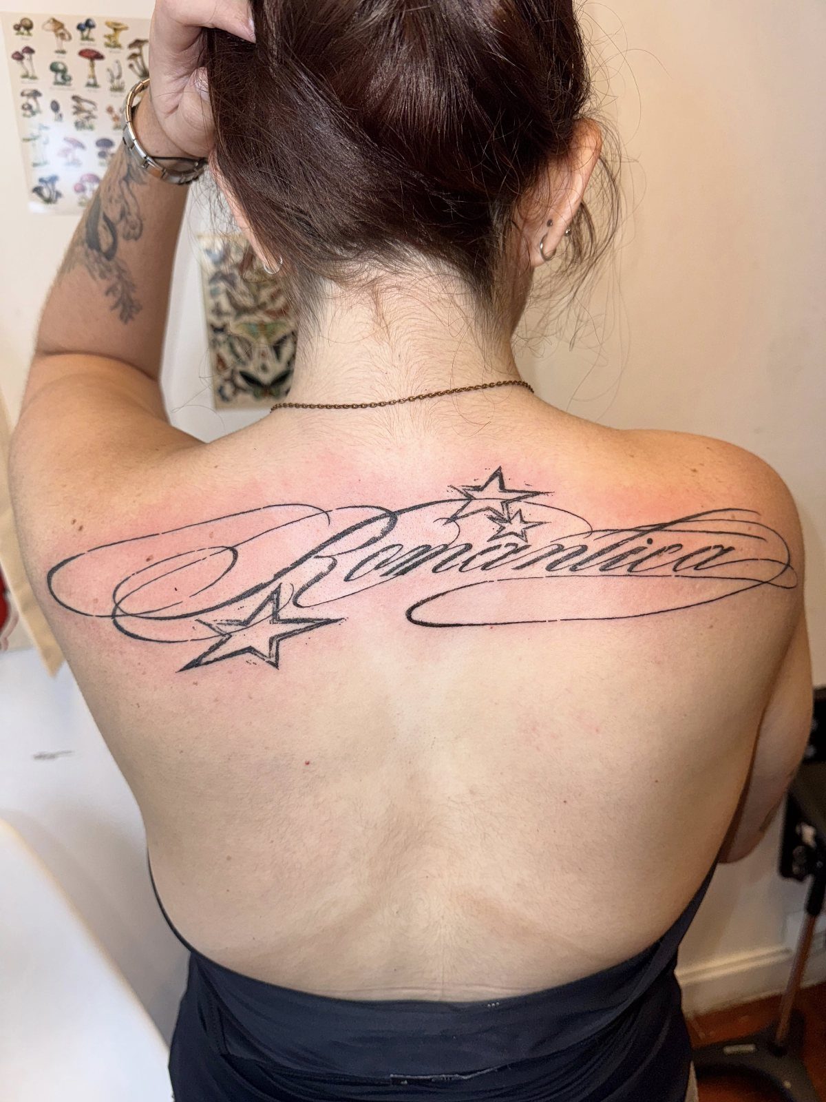
3 sketched stars and flowing ornament around a single word keeps the text readable while adding movement that plain script never achieves.
Black ink is standard for this combination; the decorative elements need the same density as the letters or they drop out over time.
I would keep the word count low, one to three words, so the flourishes have room to breathe and the whole piece does not crowd into a blur.

183PCS Different Styles Tattoos Stencil: Our temporary tattoo stencils forkids comes with 183 temporary tattoo stencils painting set design such as flowers, cats, hearts, skulls, dinosaurs, fruits, deer, scorpions, Hannah, unicorns, whales, cars, rainbows, telescopes, ships, too fast, astronauts, pirates, letters, stars and more Style in 12 sheets A5 size. Perfect for festivals, parties, or daily fashion.

30 Pcs Stencils Set: there are 30 pieces letter stencils for painting in our package, they are designed with different styles and sizes of letters, numbers, and symbols, which can help you create your own diary and plan style; Please handle the stencil with care; Avoid rubbing against the sharp edges to prevent scratching your hands

INCREDIBLE VALUE – 524 Unique Designs: This henna tattoo kit includes 20 stencil sheets with 524 patterns, featuring butterflies, florals, symbols, lettering, totems, and Egyptian-inspired designs. These henna stencils let you mix, match, and layer for custom henna temporary tattoos on hands, arms, and body. A refillable pen with a soft nylon tip is included for precise lines and varied strokes (pen does not include ink)
5. Fine Line Text
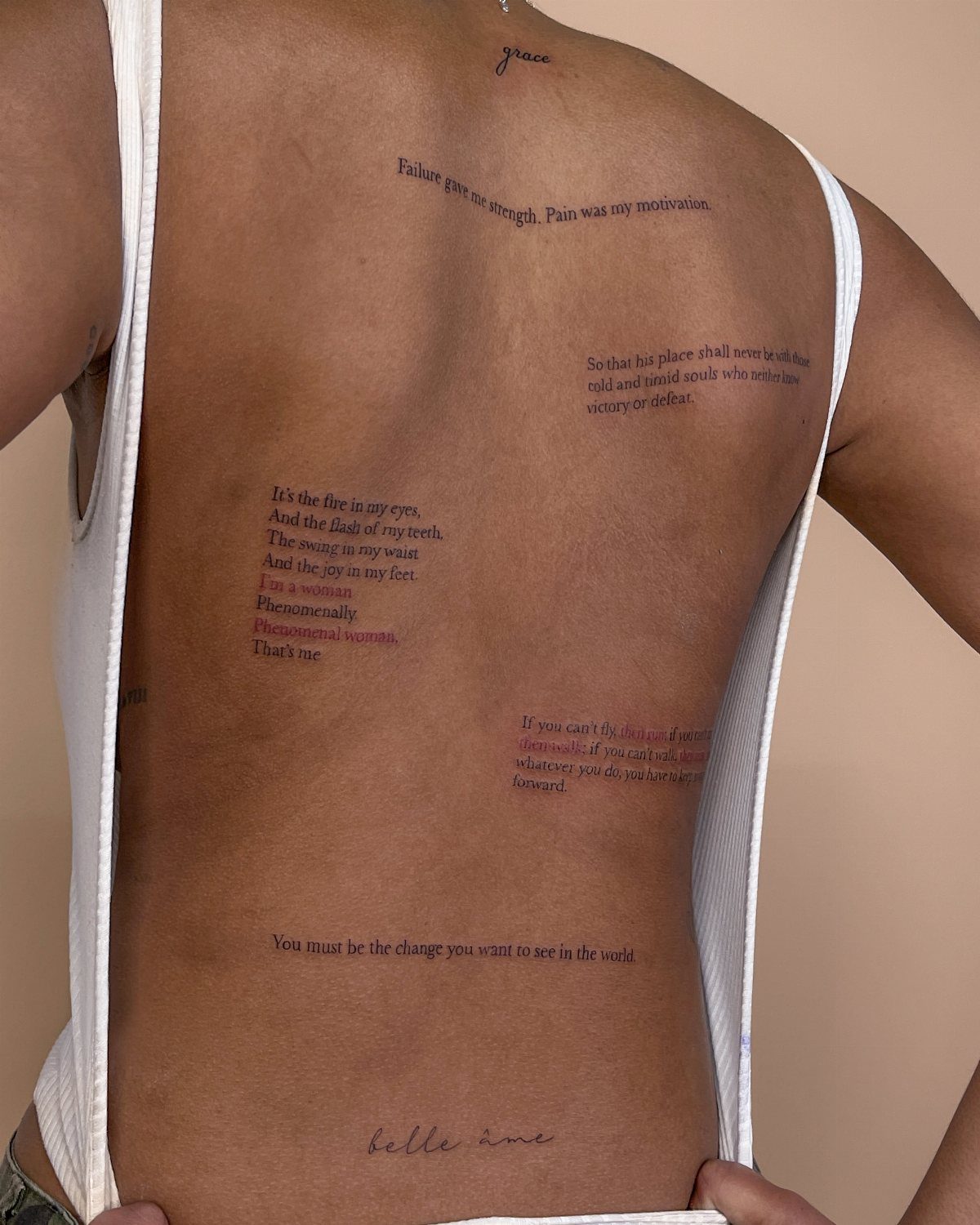
Fine line text trades visibility for discretion, a whisper instead of a statement. Several small quotes scattered across the back rather than one large piece spreads the risk; if one line blurs or ages poorly, the others still stand.
Thin needles and single-pass technique keep these lines hair-fine, but that same delicacy means touch-ups are likely sooner than with heavier work.
Vertical placement down the spine is common, though I have seen fine line words tucked along shoulder blades or floating near the waist. An experienced artist matters more here than with bold script; wobble shows instantly in lines this thin.

REUSABLD VARIETY OF OPTIONS - This set of temporary tattoo stencil includes 123 different patterns for adult,male. Scorpion tiger dragon cow eagle skeleton Tribal Symbols geometric design etc patterns in 20 pages A4 size, Almost unlimited creative combinations and options to meet your every need.

Package Includes & Sizes – The large star stencil set includes 8 PCS reusable star stencils in different sizes, featuring a classic 5 point star template design. Sizes: 9.84"x8.86", 8.86"x7.87", 7.87"x6.89", 6.89"x5.91", 5.91"x4.92", 4.72"x3.74", 3.54"x2.56", and 2.36"x1.38". A complete star stencil set to meet your DIY crafts, art projects, and decoration needs.

【 575+ Fun Assorted Tattoo Stencils 】-The ChurlChurl tattoo stencils collection includes 575 high quality stencils with multiple themes. enjoy cute trendy tattoo stencil designs like butterflies, words, flowers, symbols, totem, Egypt style patterns and more.
6. Lower Back Tattoos
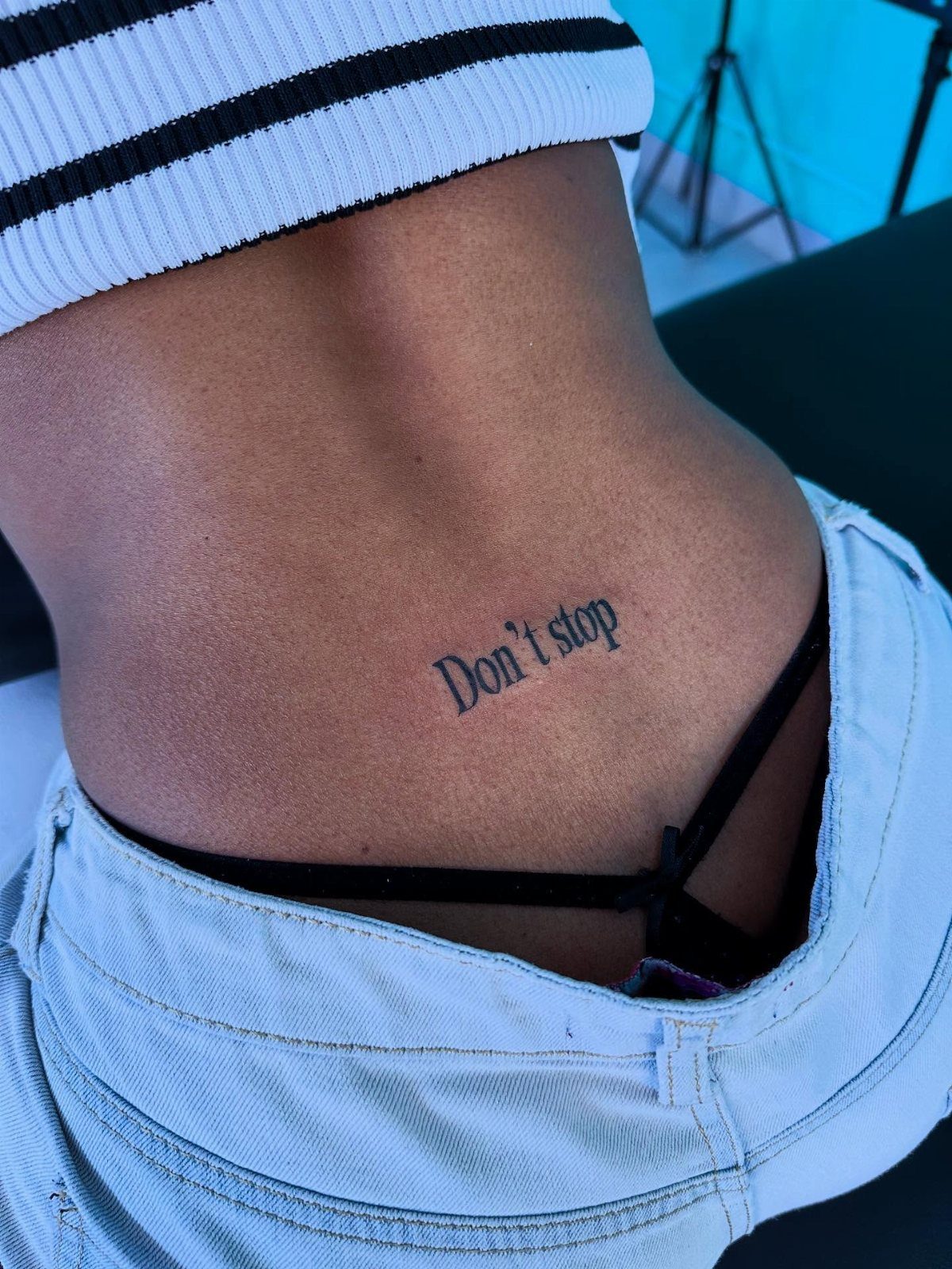
Lower back text carries the nickname no one wants, but the placement itself has practical logic: the skin there is relatively flat, easy for the artist to stretch, and the pain ranks lower than ribs or spine for most people.
A single word in cursive, maybe with small flourishes, fits the width without crowding. Horizontal placement reads naturally to someone facing you; vertical down the spine from this starting point is another option worth considering.
Jeans waistbands and gym leggings rub here, so healing takes discipline. I would schedule this for a season when low-rise anything is not in my rotation.

Package Includes: You will receive 20 sheets reusable tattoo stencils, enough quantity to meet your daily requirements. The mehndi stencils are suitable for airbrush painting, glitter tattoo, and so on.

Package contains: You will receive 6 pieces French script stencils in different designs, and each stencils size is measures about 11.8 x 8.26 inches. These French writing stencils are good for making DIY crafts and home decor.

1 Set = 12 Sheets Henna Tattoo Stencils, 6 Pairs Right and Left hands stencils. Pasting position: Hand, Finger,Forearm, etc. Suitable for Henna tattoo, Airbrush Painting, Glitter tattoo, and so on;
7. Upper Back Tattoos
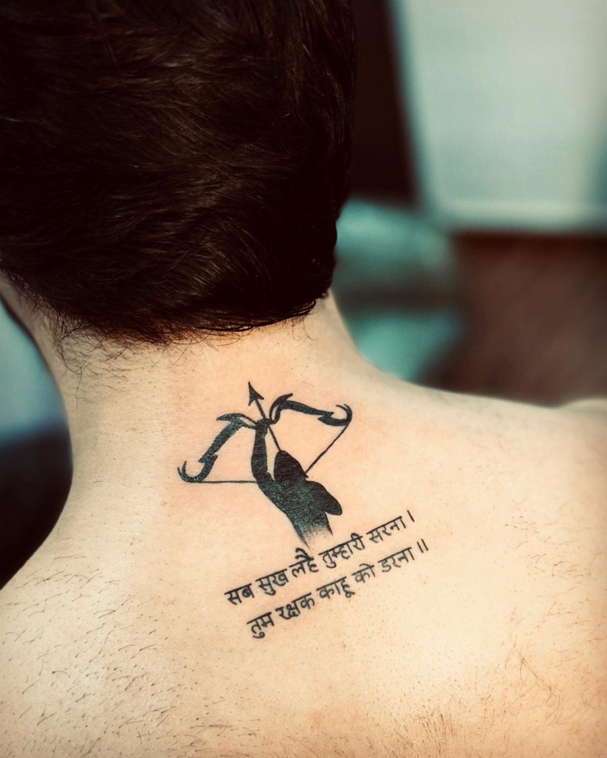
Upper back text sits where a tank top or blouse edge frames it, visible without the full commitment of a spine piece.
The flat plane between shoulder blades gives the artist a stable surface for script that stays legible as you move.
A short phrase across the upper back reads cleanly from a conversational distance. I would place it high enough that a standard bra strap or shirt collar does not slice through the middle of the text during healing.
Black ink is the common choice here, sized large enough that the characters do not close up over time but small enough that the whole phrase fits without wrapping onto bone.
This placement works for first back pieces because the pain tends to be moderate and the area easy for the artist to reach.

MADE IN THE USA SINCE 1990: For over 30 years Dynamic Color has produced professional tattoo ink in the United States, an established American brand artists built their work on long before most imported labels existed.

MADE IN THE USA SINCE 1990: For over 30 years Dynamic Color has produced professional tattoo ink in the United States, an established American brand artists built their work on long before most imported labels existed.

Triple Blackout Tattoo Ink - Strengthen your shading with Triple Blackout, the boldest black designed for greater dimension in your tattoos. With a glycerin free formulation, this professional tattoo ink inserts smoothly into the skin for excellent distribution and shading.
Tattoo Placement Tips
Text on the back moves with the body in ways flat paper never does. A vertical spine piece shortens when you stand straight and lengthens when you slouch; horizontal upper back text tilts with shoulder rotation.
Ask your artist to mark the stencil with you in 3 positions: standing relaxed, sitting, and with arms raised to shoulder height. What reads as centered while you face a mirror can drift left or right when you turn.
Visibility shifts with clothing in ways worth planning for. A phrase placed between the shoulder blades hides under standard workwear and appears in a sleeveless top.
Lower back text stays covered by any shirt that hits the hip. Consider which version of yourself, dressed up or dressed down, you want carrying that message.

★ FAVORED BY PROFESSIONALS: Be original, make your own semi-permanent tattoos. Our laser water slide decal paper is used around the world by professionals and businesses.Print tattoos effortlessly using our skin safe temporary tattoo transfer paper and make great long lasting and waterproof temporary tattoos with zero skin irritation when following the simple instructions provided.
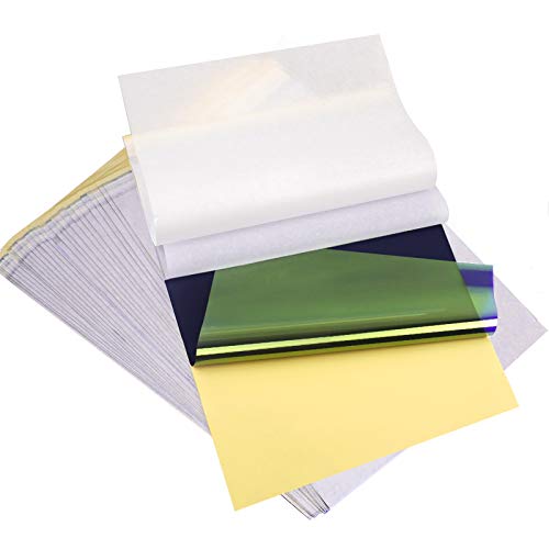
ADVANCED MATERIAL: Tattoo transfer paper is made with the high quality dyes and stencil paper. Transfer marks are very clear, clean and smooth. Tattoo transfer paper kit come with 35 sheets. Great for tattooing, trace and transfer images onto the body.<br>

NOTE: After printing the tattoo stickers using an inkjet printer, be sure to dry them with a hairdryer before laminating them.
Font Considerations
I would test a font at actual size on paper taped to my back, viewed from across the room, before committing.
Ornamental additions, stars or swirls, need weight matching the letters or they fade faster and leave ghost marks. One to three words maximum if you want decoration around them; plain script can stretch longer because the eye reads it faster.
Colored lettering on the back sounds distinctive but ages to muddy faster than you might want on a canvas this size.


5 Pc Alphabet Template: Sturdy, Flexible And Durable With Raised Ribs To Prevent Smudging Stenciling Guide Contains A-Z, A-Z, 0-9 And Other Punctuation Symbols A-Z Letter Sizes From: From 1/4 Inch To 1-9/16 Inch a-z Letter Sizes From: From 1/4 Inch To 7/16 Inch Numbers And Other Symbol Sizes: From 1/4 Inch To 1-9/16 Inch
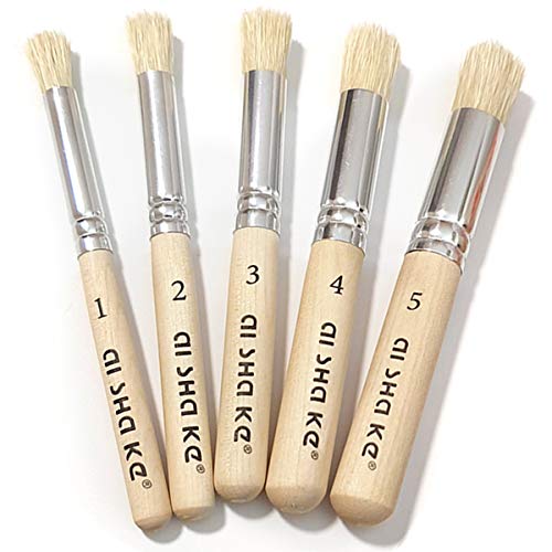
5 VARIOUS SIZES OF STENCIL BRUSHES: Set contains 5 versatile stencil brushes with a variety of sizes make art work more easy and you always have the right brush for painting projects. Perfect for artists and painters of all levels. Brushes Size: #1 #2 #3 #4 #5; Length: 12.3 cm ~ 12.6 cm.
Pain Levels
The upper back, between shoulder blades, ranks among the easier placements for most people. Muscle padding dulls the needle sensation; sessions run longer without the breaks that rib or spine work demands.
Spine text hits different.
Bone sits close to skin there, and the vibration travels. Artists working the spine often schedule shorter sessions to let you recover, which raises the total time commitment even if the overall sensation is brief.
Lower back pain varies more by individual. Some find it moderate, nearly matching the upper back; others hit nerve clusters near the iliac crest that sharpen the experience.
The skin there stretches easily, which helps the artist work faster, but the trade is waistband rubbing during weeks of healing.
No back placement is painless. Plan meals beforehand, bring headphones, and book morning appointments when pain tolerance tends higher.

Diverse Usage Scenarios: This 6-piece star painting stencil set can be applied to various surfaces, including walls, wood, canvas, and fabrics. Decorate living rooms, make unique wooden art, or add charm to canvas bags—ideal for all these uses.

▶ Henna Tattoo Kit: 16 sheets tattoo stencils. airbrush tattoo stencils suitable for tattoo lovers. Experience the effects of tattooing without the pain of tattooing.

Patriotic 50-Star Flag Design: Perfect for Independence Day, 4th of July, Veterans Day, and patriotic DIY projects. Create authentic USA-themed decor effortlessly
Frequently Asked Questions
What is the best font for a back tattoo?
Cursive and fine line fonts are the common choices for back text because the curves follow the body’s natural shape better than block letters.
Ornate script in black ink ages cleaner than thin cursive with color, which blurs faster than most people expect.
Taping a printout at actual size to my back and reading it from across the room has saved me from fonts that looked elegant up close and illegible at distance.
Are tattoos on the back painful?
The upper back between shoulder blades ranks among the easier placements for most people because muscle padding dulls the needle sensation.
Lower back pain varies more by individual, with some finding it moderate and others hitting nerve clusters near the iliac crest that sharpen the experience.