The 13 styles below run from a single-session fine line piece to a multi-session Japanese sleeve, and your existing ink is what sorts them: first-timers wanting something that ages clean tend toward black ink skulls or geometric patterns, while collectors building around older work need to know which traditions pair without fighting.
A 3RL needle grouping is the specification that separates a line that stays sharp from one that fuzzes out by month six, and fine line tattoos on this list are the ones that live or die by it.
1. Detailed Black Ink Designs with Skulls
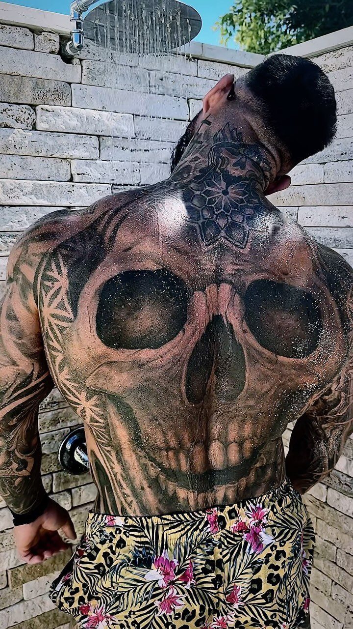
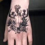
Skulls read differently in black ink than in color: the absence of shading forces the eye to follow line weight alone, so a plague doctor’s beaked mask or a geometric frame around the jaw has to carry the whole composition.
I like this style for a first large piece because it ages into itself; the black settles, the lines stay legible, and the image does not depend on color saturation to keep reading well.
Ask your artist about packing the solid areas tight enough that they do not grey out unevenly.

MADE IN THE USA SINCE 1990: For over 30 years Dynamic Color has produced professional tattoo ink in the United States, an established American brand artists built their work on long before most imported labels existed.

Flows smooth through every needle grouping; crisp outlines with no blowouts and solid fills on the first pass

MADE IN THE USA SINCE 1990: For over 30 years Dynamic Color has produced professional tattoo ink in the United States, an established American brand artists built their work on long before most imported labels existed.
2. Realistic Animal Portraits
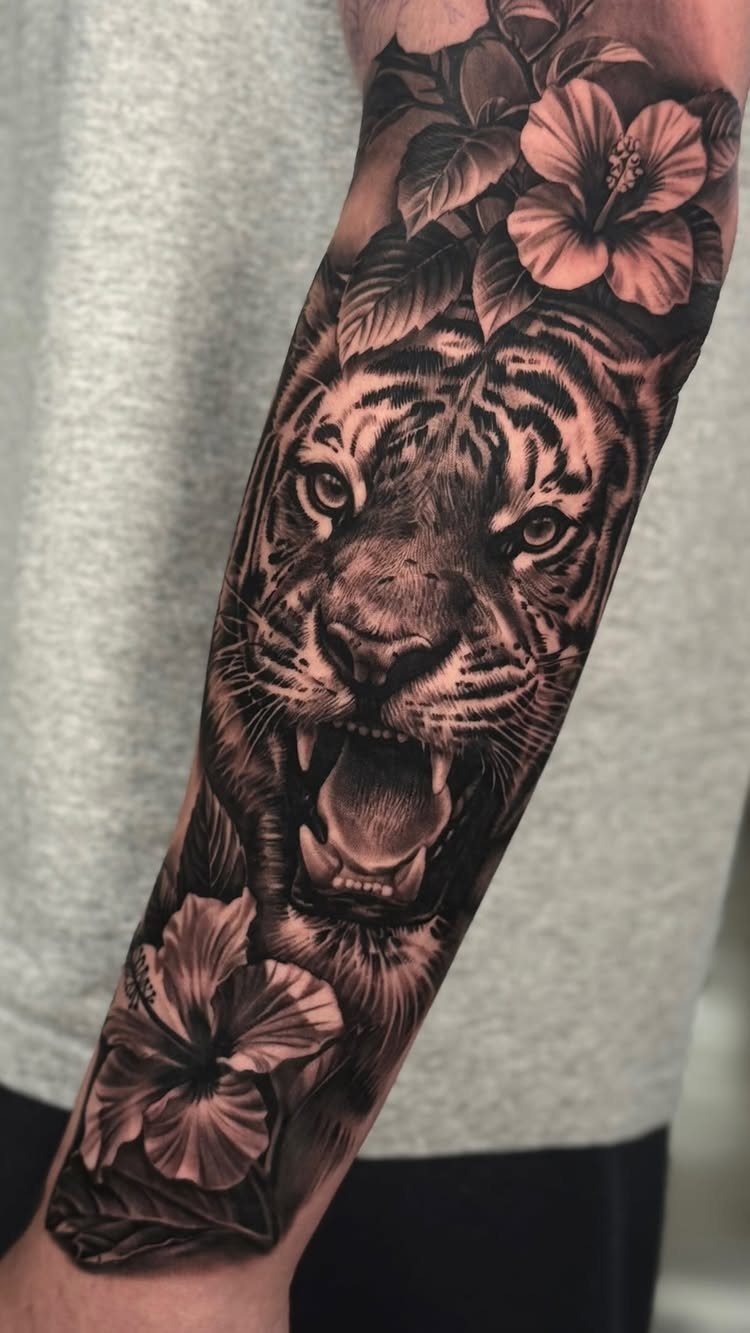
A wolf on the calf or a tiger winding up a forearm works when the fur texture is built from individual hair groups rather than airbrushed smooth; the eye catches the direction of each clump, and the animal looks alive instead of printed.
Black and grey is the usual choice here, with the dark values dropped into the neck and shoulder area to give the head weight.
Placement on a rounded muscle like the calf or outer thigh lets the portrait sit flat when you are standing and move as the fur should when you flex.
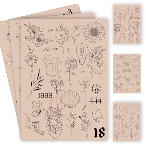
100+ Pre-Printed Designs – Features a wide variety of fine line and tiny tattoo stencils to enhance detailing skills.
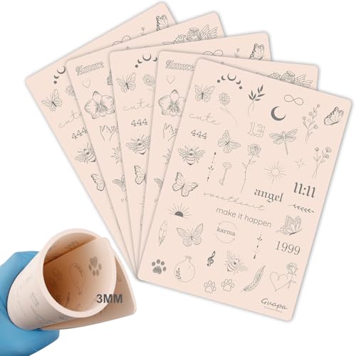
3MM Tiny Tattoo Practice skin Made from high-quality materials, it is closely mimic the texture and feel of real human skin. This gives you a realistic experience, allowing you to refine your skills before working on actual clients

Premium Quality 1.5mm Silicone Material – Crafted from premium 1.5mm thick silicone, this tattoo skin offers a true-to-life feel with excellent durability and a smooth surface for effortless needle movement during practice.
3. Japanese Style Tattoos
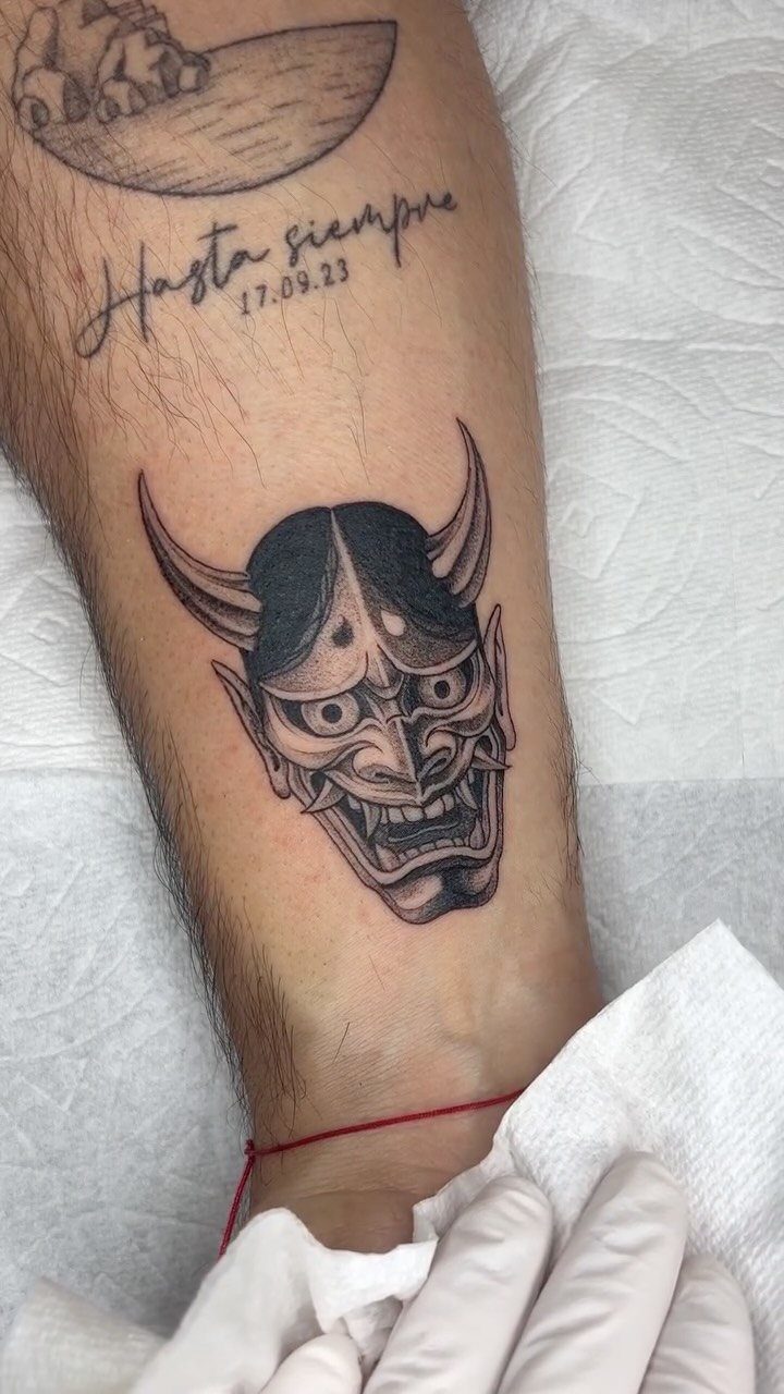
Japanese work builds its scenes from established vocabulary: the Hannya mask, the koi upstream, the dragon in clouds, each element carrying its own meaning and its own rules for direction and pairing.
A sleeve or back piece holds these best, not because a small tattoo is impossible but because the storytelling needs room to breathe.
Color is traditional, though the black and grey version keeps the same compositional logic; the mask faces where tradition says it should, the background elements still flow around it.
Find an artist who knows the difference between borrowing the look and working in the lineage.

RICH TEMPORARY TATTOO KIT - Contains rich tattoos pattern templates (126 designs),6 tattoo inks in 2 colors (black and brown),4 disposable gloves 1 pack of cleaning supplies,allowing you to easily create unique personalized tattoos

Warm Tips: The tattoo transfer paper need to work with transfer medias.You will need to purchase the stencil ointment separately. Apply the design made on the master paper. Please pay attention to press the back side of the pattern to the skin for at least 3 seconds

6 Japanese Style Design Sheets – Traditional dragon, koi fish, phoenix, and samurai artwork gives you an authentic full-arm sleeve look in one easy application.
4. Floral Designs
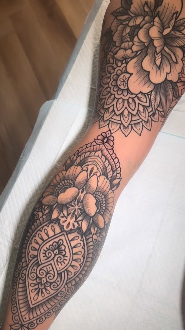
Roses and mandalas layer well because both forms want to spiral: the eye follows a petal into the center, then finds the geometry holding it there.
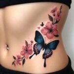
Black and grey suits this if you want the linework to stay crisp; color works when the flower is the main event and the geometry serves as frame.
I have seen this paired with script on the same limb, the text running straight while the florals curve around it, and the contrast of line types keeps both readable.
The forearm and upper arm give enough length for the mandala to open fully without compressing its detail.

72 Unique & Vibrant Animal Designs --- Unleash creativity with 72 laser-cut animal stencils! This complete set features a wild variety including lions, elephants, tigers, cheetahs, foxes, and even magical unicorns. Each detailed, kid-friendly design is perfect for creating a colorful animal kingdom on any project

🎨【72-Piece Wildlife Creature Painting Kit - Ultimate Animal Stencils Collection】: Unleash creativity with this comprehensive set of 72 reusable animal stencils for kids and adults. Features detailed templates of lions, elephants, zebras, pandas, monkeys, owls, deer, foxes, and many more jungle, forest, and safari animals. Perfect for DIY wall art, fabric painting, wood signs, canvas projects, scrapbooking, and classroom activities. Ideal as a painting stencil set for endless wildlife-themed crafts and educational projects.

Fun Mix-and-Match Animal Design: This set includes 12 unique stencils featuring cute farm and jungle animals, bear, cow, elephant, monkey, lion, turtle, dinosaur, dog, rabbit, zebra, sheep, duck, with interchangeable facial parts. You can mix and match to create endless silly, custom animal faces
5. Cursive Text Tattoos
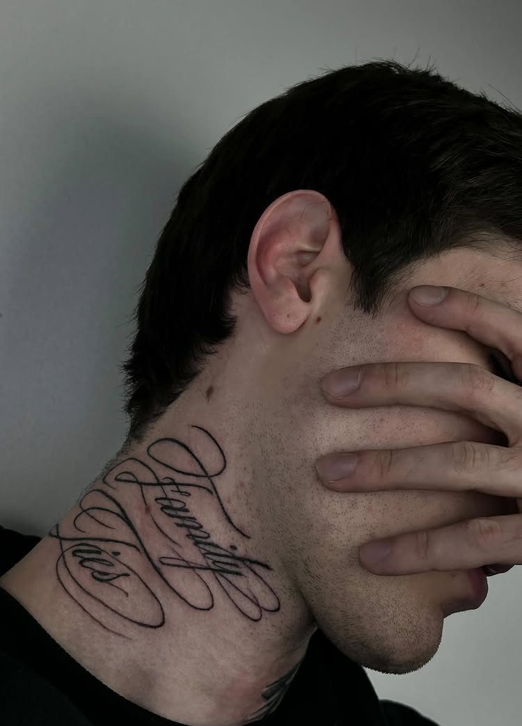
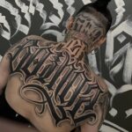
Script on the neck or thigh lives or dies by spacing: too tight and the letters merge in a year, too loose and the phrase reads as separate words instead of one breath.
"Family Ties" works at this size because the ascenders and descenders have room; a longer quote wants a flatter placement, the ribs or the outer thigh where a line can run without wrapping.
Pair it with small symbols if you want, but keep them subordinate; the text is the tattoo, the rest is punctuation.

Hollow Out Stencil: You will receive 4 pcs painting template with lotus flower pattern which is made of high quality PET material with good strength and stability, flexible and durable, lightweight and portable, rounded edges and corners won't hurt anyone. The overall size: 8inch/20.2cm wide, 8inch/20.2cm long.


[AUTHENTIC INDIAN & ARABIAN DESIGNS]: Features 6 pairs (12 sheets total) of premium henna stencils with matching left-right hand floral patterns, featuring vine tendrils, scrollwork, stars, mandalas, and geometric motifs. Specifically designed for hand back applications, perfect for bridal henna, blending traditional Indian mehndi and Arabian arabesque styles.
6. Geometric Patterns
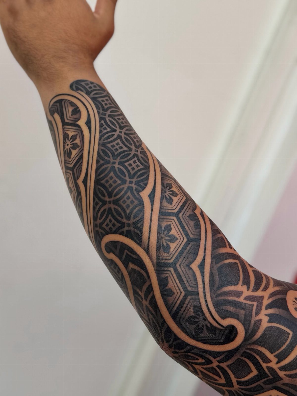
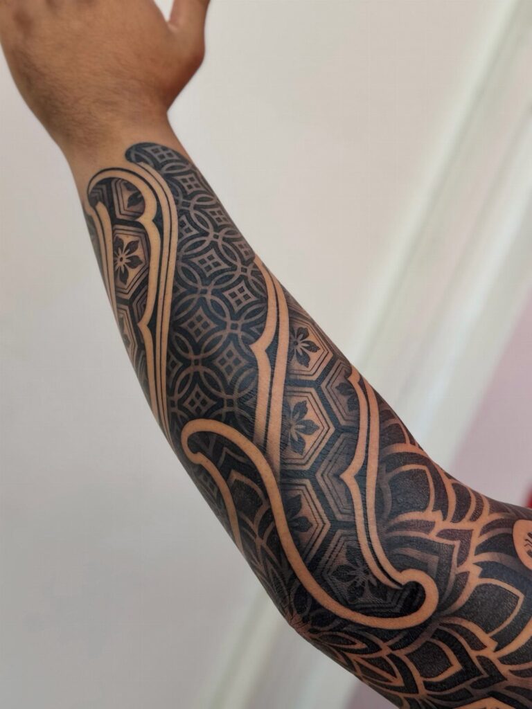
Geometric sleeves reward patience in the chair because the tessellations have to align across sessions; any gap between appointments can shift how you hold your arm, and the artist needs you in the same position to continue the pattern.
Negative space becomes part of the design here, the skin showing through as shape rather than background.
I would ask to see healed photos before committing; the crisp edge of a fresh geometric line softens, and you want to know how your artist plans for that.

🦋Note: Shake the ink thoroughly prior to use.

MADE IN THE USA SINCE 1990: For over 30 years Dynamic Color has produced professional tattoo ink in the United States, an established American brand artists built their work on long before most imported labels existed.

Triple Blackout Tattoo Ink - Strengthen your shading with Triple Blackout, the boldest black designed for greater dimension in your tattoos. With a glycerin free formulation, this professional tattoo ink inserts smoothly into the skin for excellent distribution and shading.
7. Fine Line Tattoos
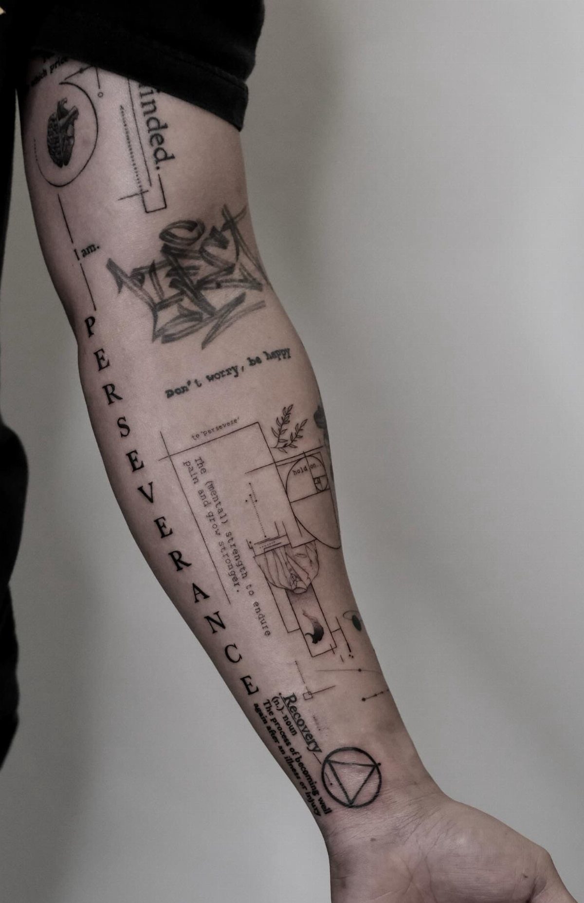
Fine line work lives or dies by needle diameter; a single pass at 3RL leaves no margin for error, so the artist’s hand steadiness matters more than the design itself.
The inner forearm suits this well because the skin there is thin and flat, letting the line sit clean without stretching over muscle.
Geometric diagrams and text pair naturally in this style because both need the same precision; the eye reads the whole arm as one system instead of separate pieces.
Ask to see healed lines before you book; anything that looked sharp fresh can fuzz out later if the depth was off.
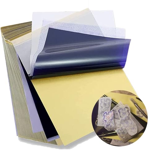
Standard size: Tattoo Transfer Paper is standard A4 paper size, each measures 8.27 in X 11.69 in. There are 4 levels in total. The thickness of the paper is very light and smooth to the touch.

🔍 Precision Industry-Standard Transfer - Engineered 4-ply stencil paper (8.25"x11.75") with high-density dyes delivers defined lines for intricate tattoo stencils. Compatible with major thermal printers for reliable tattoo transfer paper workflows.

8. Tribal Tattoos
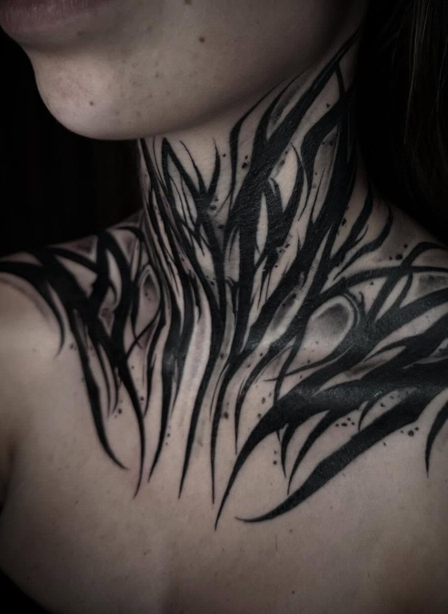
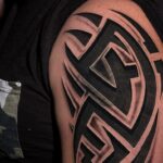
Tribal work carries weight differently than people expect; the black is packed so solid it becomes a shape rather than a drawing, and that shape has to follow the body’s own lines to move right.
Neck and chest placements work when the design flows with the collarbone and sternocleidomastoid, not against them; sharp points that look aggressive on paper can distort when the skin shifts.
Abstract or representational, the tradition is in the flow, not the specific pattern. I would plan for more sessions than the size suggests; solid black at this scale needs healing time between passes to avoid scarring.

📦 【ALL-IN-ONE HENNA TATTOO KIT】 Unlock your creativity with our comprehensive DIY body art set! This mega bundle serves as a complete henna tattoo kit , including 149 diverse stencils, 6 premium henna cones in 3 rich colors (2 Black, 2 Brown, 2 Dark Red), paint brushes, cotton swabs, and gloves. It packs all essential tattoo supplies and body paint tools in one organized box, making it the perfect hassle-free alternative to traditional tattoo gun setups or messy transfer paper methods.

✔[FULL SLEEVE FLOWER TATTOO] Briyhose Colorful Japanese Drama Full Arm Temporary Sleeve Tattoos Can Cover Your Body Parts Large. It Contains 4 Sheets 18.9 * 6.7 Inch (48 * 17cm) Long Sleeves Monster Fish Japan Stage Play Fake Tattoo Stickers For Women Tatto Kit. You Can Share It With Your Family And Friends.

REUSABLD VARIETY OF OPTIONS - This set of temporary tattoo stencil includes 123 different patterns for adult,male. Scorpion tiger dragon cow eagle skeleton Tribal Symbols geometric design etc patterns in 20 pages A4 size, Almost unlimited creative combinations and options to meet your every need.
9. Portrait Tattoos
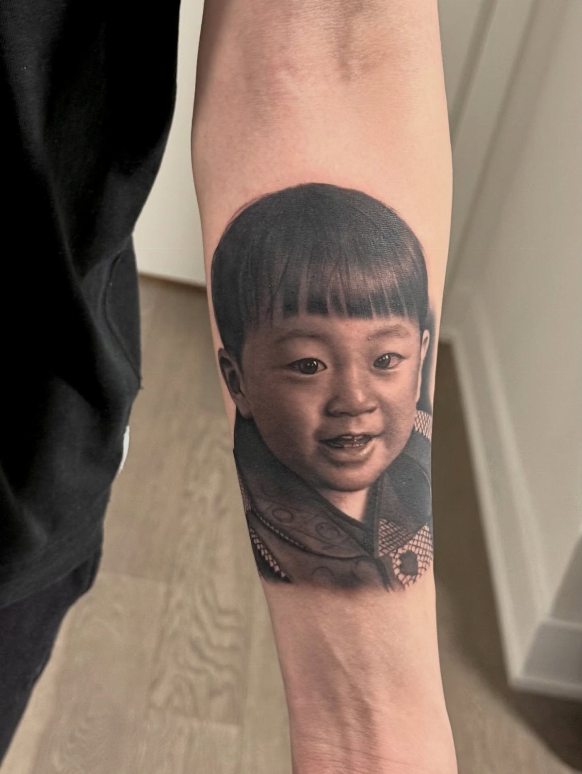
A portrait on the forearm or calf needs the subject’s features sized to read from conversation distance; too large and the likeness breaks up, too small and the detail turns to mud.
Black and grey handles skin tones better than color because the value range is built from ink density, not hue matching, and density is easier to control across sessions.
The artist should work from a high-resolution photo with clear shadow shapes, not a blown-out phone shot where the midtones flatten.
Placement on a relatively flat area keeps the proportions honest; a bicep that flexes will stretch a face in ways that age badly.
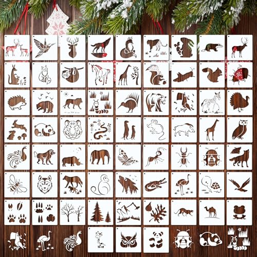
What You Will Receive: the package contains plenty of stencils for painting on wood, plenty in quantity, rich in style, various different matching shapes give you unlimited possibilities to create various DIY art projects for your daily use and replacement needs, you can also share with your friends and family

Vivid Set: you will receive 20 pieces stencils of various kinds, a variety of different matching shape give you endless possibilities to create various DIY art projects, bringing vivid decor to your home in minutes

【Stencil Kits Animals】: The animal stencils for painting on wood contains 50 pieces of small painting stencils in 50 different styles, each stencil size measure about 4x4inch. There is a sufficient quantity and rich design, which will meet your different needs for drawing handicrafts and DIY crafts.
10. Mechanical Tattoos
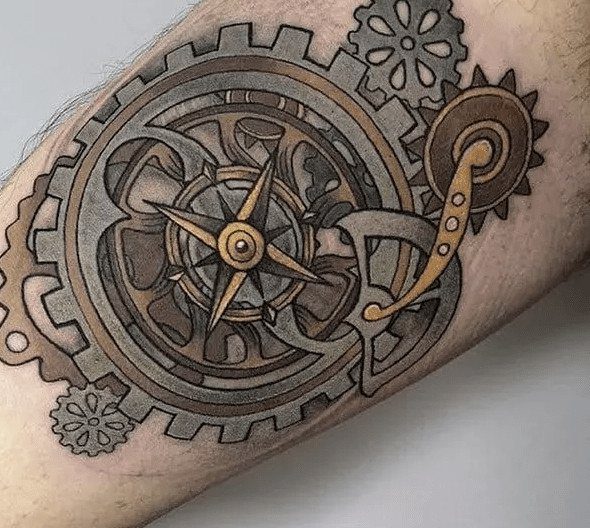
Mechanical designs ask the viewer to believe the skin is a surface over something else; the tear or peel has to be rendered with shadow depth that matches the room’s light source, or the illusion fails.
Cogs and gears need teeth that would actually mesh if they were real, so the artist is part draftsman here.
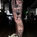
A leg placement gives the vertical space for a clockwork stack that reads as weight descending, the anchor in the lower portion pulling the eye down.
The metallic sheen is suggested through grey values, not silver ink; ask how the artist plans the highlights to survive healing, fresh white always drops out lighter than intended.

COMPLETE KIT: Set includes 18 sheets of self-adhesive henna stencils featuring traditional Indian Mehndi designs for hands and body art

What's included: 1 Set = 9 sheets henna tattoo stencils, template size: 21 cm x 12 cm/8.2" x 4.7" (Only Templates,No Tattoo Ink); Paste location: hand, finger, forearm, legs and other parts of the body

Arm Tattoo Stencil Set: This set includes 6 arm temporary tattoo stencil sheets in 3 pairs, featuring symmetrical designs with intricate floral, mandala patterns for creative body art
11. Intricate Celtic Knotwork
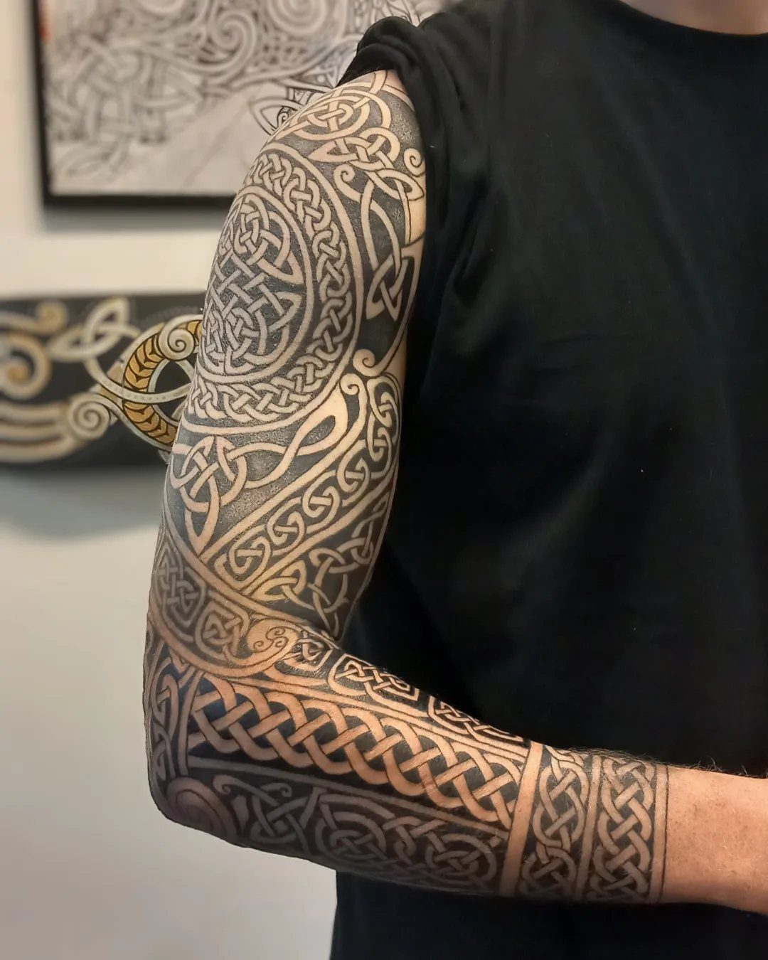
Celtic knotwork is built from a single continuous line, and the arm’s length lets that line run without the compression that turns a sleeve pattern into a blur.
The interlocking forms need consistent line weight to read as weaving; too thin and the crossings tangle, too thick and the negative space disappears.
A full-arm piece holds the teardrop or circular frame elements where they belong, at shoulder and wrist, with the knot density increasing toward the center.
Black and grey ages cleaner here than color would; the brown of historical manuscripts is a reference, not a requirement, and ink on skin is its own medium.
12. Abstract Tattoos
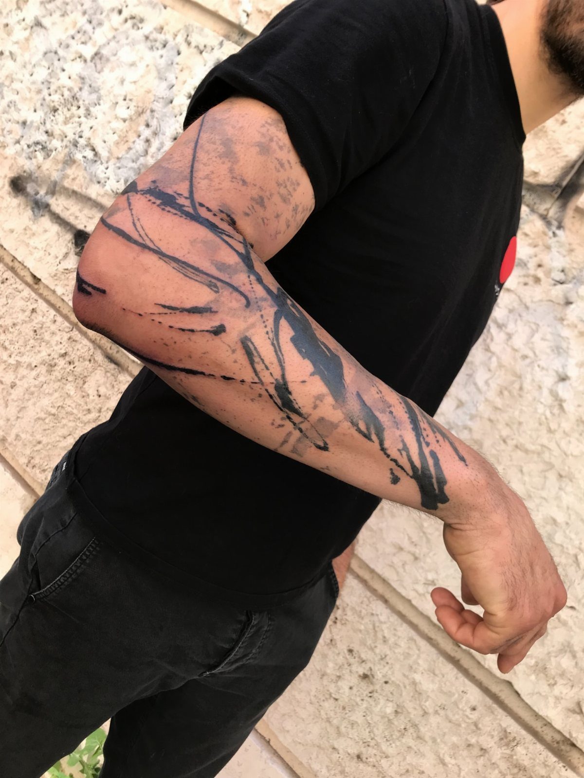
Abstract work frees the artist to follow the arm’s shape instead of fighting it; brush strokes that widen toward the elbow and splatter that thins past the wrist use the body’s geometry as part of the composition.
Black ink on skin reads as gesture rather than illustration, the weight of each mark carrying emotion that a recognizable image would pin to a specific meaning.
Color can enter as accent, a single warm tone against the black, but the piece holds together on value contrast alone.
The forearm and elbow placement lets the design move with the joint; what looks chaotic still at rest becomes intentional when you bend your arm.
13. Dagger Tattoos
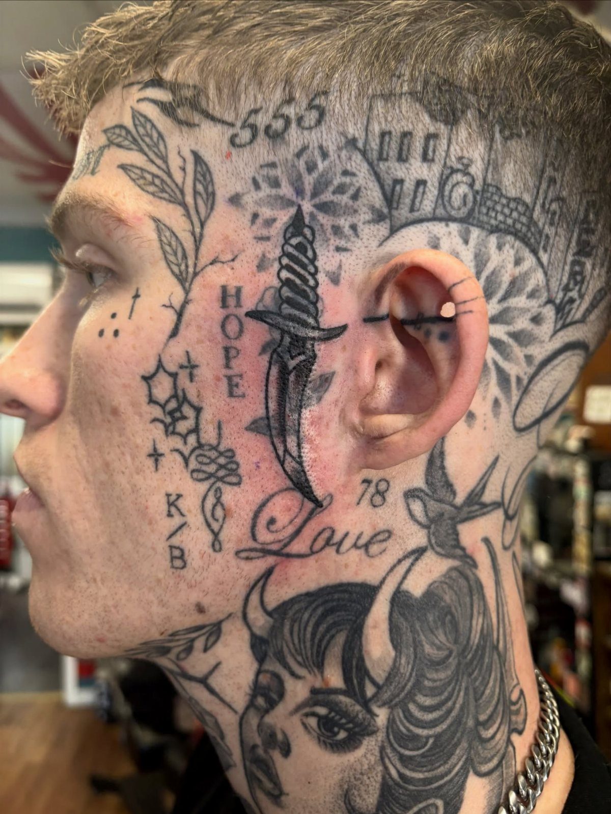
A dagger tattoo works best when it is doing something: piercing, wrapped, or paired. The blade alone is a shape; the blade through a skull or coiled by a snake becomes a story.
Black ink keeps the lines legible at small sizes, which matters because daggers often sit where space is tight, the neck or behind the ear or running down the side of a finger.
The straight edge of the blade gives the artist a chance to show clean linework; any waver reads immediately, so I would check healed photos for that specifically.
Snakes add motion, skulls add weight, and either one turns a symbol into a scene worth returning to.
Advice for First Tattoos
Placement for a first tattoo should account for how much the skin shifts with daily movement.
The outer forearm and calf stay relatively stable, so the design you approve in the stencil holds its proportions after healing. The ribs and inner bicep stretch and compress enough that a first-timer might not predict the final look.
Size matters for how the detail ages. A piece smaller than your palm will lose its fine lines faster than something with more room for the ink to spread.
If the image carries personal weight, build that meaning into the composition itself rather than relying on a caption or a date the viewer has to ask about.
Research means looking at healed work, not just fresh photos. An artist’s portfolio should include healed pieces from months prior, especially in the style you want.
The style match matters more than general skill; someone who does excellent traditional color may not be the right hand for fine line black and grey.
Tattoo Aftercare Tips
Clean means washing with unscented soap and your hand, not a cloth or loofah that can pull at the forming scab. Pat dry with a paper towel; bathroom towels hold bacteria even when they smell fine.
Moisturize after the first wash and whenever the skin feels tight, but stop before the surface stays slick. Over-lotioned skin macerates and can push out ink with the excess fluid.
Sun exposure during healing is not just about fading; fresh skin burns faster and that damage reaches the pigment beneath. Keep the tattoo covered or use clothing, not sunscreen, until it has fully closed over.
After healing, SPF 30 or higher on the area every time it sees daylight. Black ink greys out faster than people expect when UV hits it regularly.
Your artist’s instructions override anything general.
If they recommend a specific balm or a different washing schedule, follow that. They know how their needle depth and ink choice heal on their clients.
Choosing a Tattoo Artist
A portfolio match means finding healed work in your specific style, not adjacent styles done well.
A realism specialist who has never done Japanese composition may not understand how background elements flow around a central figure, even if their single subjects are technically perfect.
Reviews should mention how the artist handles design changes during the appointment, not just the final result. Someone who refuses stencil adjustments or pressures a placement you did not ask for is showing you how the session will go.
Licensing is state-level in the US and requirements vary.
Most states require a bloodborne pathogen certification and an inspected facility; some add individual artist permits. Check your state health department’s listing rather than assuming a shop certificate covers everyone working there.
The consultation matters as much as the portfolio. Bring reference images, ask about their healed photos, and note whether they explain why a placement or size works or does not work for your specific idea.
An artist who cannot say no to a bad fit will not save you from a mistake.
Frequently Asked Questions
What are the most trending tattoo styles for men?
Black ink illustrations with skulls, realistic animal portraits, and Japanese designs are holding steady right now. I see these across portfolios because they age well and carry enough meaning that people do not outgrow them.
Japanese work in particular keeps its audience because the vocabulary of masks, koi, and dragons gives each piece a story that stands apart from trend cycles.
What tattoos look best on guys?
The ones that fit your body type and move with your specific build. A portrait on a relatively flat forearm keeps its proportions honest, while tribal work needs to follow the collarbone or sternocleidomastoid to look like it belongs there.
What are common tattoo styles?
Tribal, geometric, floral, and realistic tattoos show up everywhere because each solves a different problem.
Tribal uses solid black as shape rather than drawing; geometric builds from tessellations that need alignment across sessions; floral spirals inward toward a center; realism depends on value range from ink density rather than hue.
All of them need an artist who has healed work in that specific style, not just general skill.