Opposites tattoos for matching sets range from a quick single-needle wrist piece to a four-hour lower leg sit with full color saturation, whether you are drawn to sun and moon pairs, yin yang symbols, or flame and water designs.
The deciding factor is how much shared context you and the other person already have; a sun and moon pairing lands because the symbolism is universal, while generic puzzle pieces usually do not interlock the way the concept promises.
A black and red palette keeps sun-and-moon pairs legible years later even when touch-ups happen on different schedules in different states.
1. Sun and Moon Tattoos
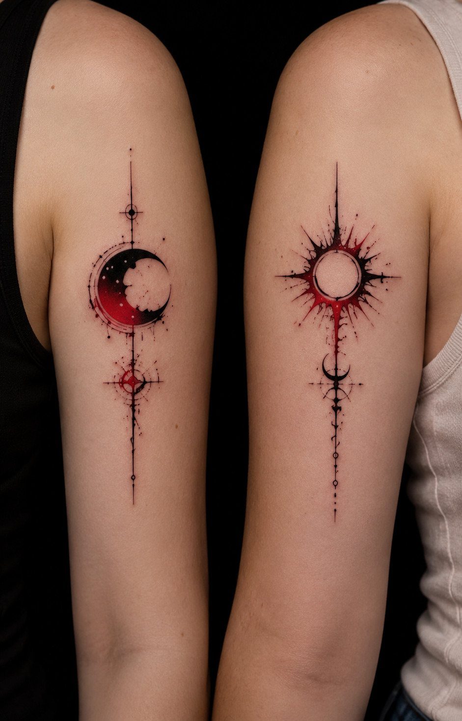
Sun and moon pairings are the oldest visual shorthand for opposites that still read instantly on skin. I like the geometric versions for how little space they need; a wrist or forearm carries the full idea without crowding.
Line weight matters more than size here.
The rays and crescent need to stay distinct at a distance, so I would ask for single-needle work on the fine points and avoid packing too many stars around the moon. One or two dots do the job.
A black and red palette keeps both symbols legible as they age, which matters when you are matching someone who lives in a different state and will not get touch-ups together.

Moon Phase Stencil: You will receive 10 pieces of painting stencils which have beautiful patterns in border theme. There are moon phase, mountain, sun patterns on the stencils. Our templates are suitable for you to make small border decoration by yourself.

SIZE - 4 sheets large gold sun moon star temporary tattoos with beautiful metallic designs, original brand of Briyhose fake tattoos for adults women girl, size is 8.27 * 5.83 inch (21 * 14.8cm) 4 Sheets tatoos kit, used for wrist, arms, half sleeves, forearm, shoulder, back, neck, hands, finger, ear, legs, thigh and any other part of your body skin.

Exquisite body art that can be worn in place of jewelry. Celebrity inspired.
2. Opposite Best Friend Tattoos
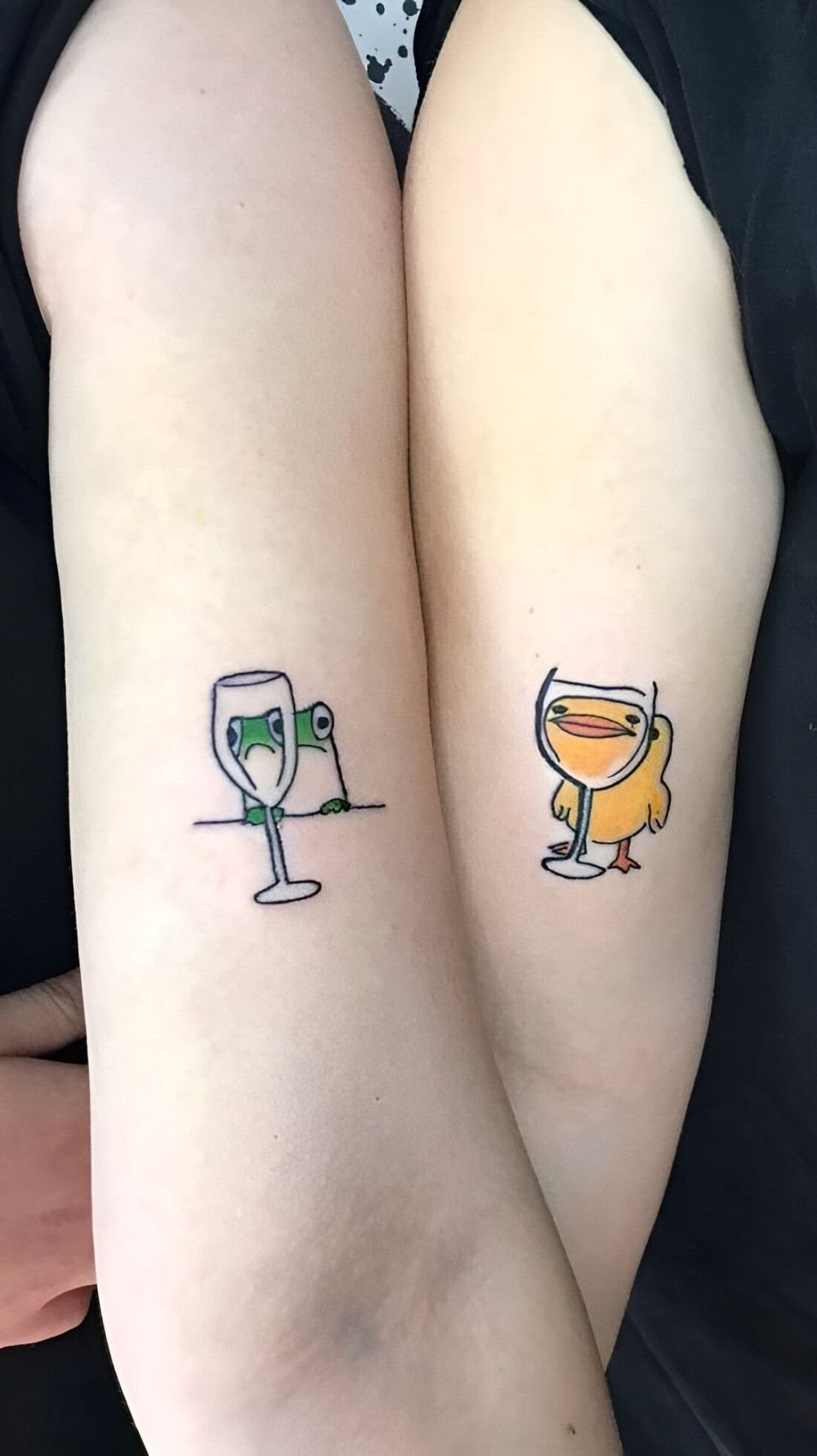
A frog sulking behind glass and a bird grinning through it: the joke lands because the two of you are in on it.
Opposite friend tattoos work because the contrast itself is the connection. They fail when the contrast is too abstract to explain at a party.
I would push for specific characters or objects you already share, not generic sun-and-star pairings. Puzzle pieces work only if the shapes actually interlock; most tattoo versions do not, so check the stencil before the needle touches skin.
Placement on the forearm keeps it visible for the photo you will take together and hideable for the job interview you will not.

Quantity: 10 Pieces individual best friends tattoos. More than 40 cute designs, each design contains at least 2 copies or 2 matching designs as a set.

Includes:168 packs of parrot theme tattoos temporary, the number is enough to meet your needs and they can let you get an impressive happy party.
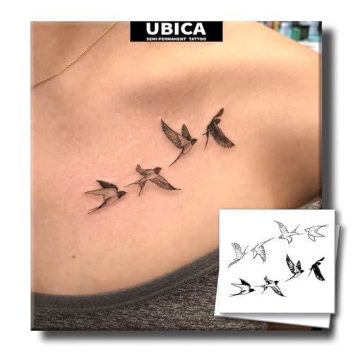
【Natural & Skin-Friendly】Made with plant-based extracts and free from harsh chemicals, UBICA semi permanent tattoos are gentle on all skin types—even sensitive skin. Express yourself without irritation!
3. Yin Yang Tattoos
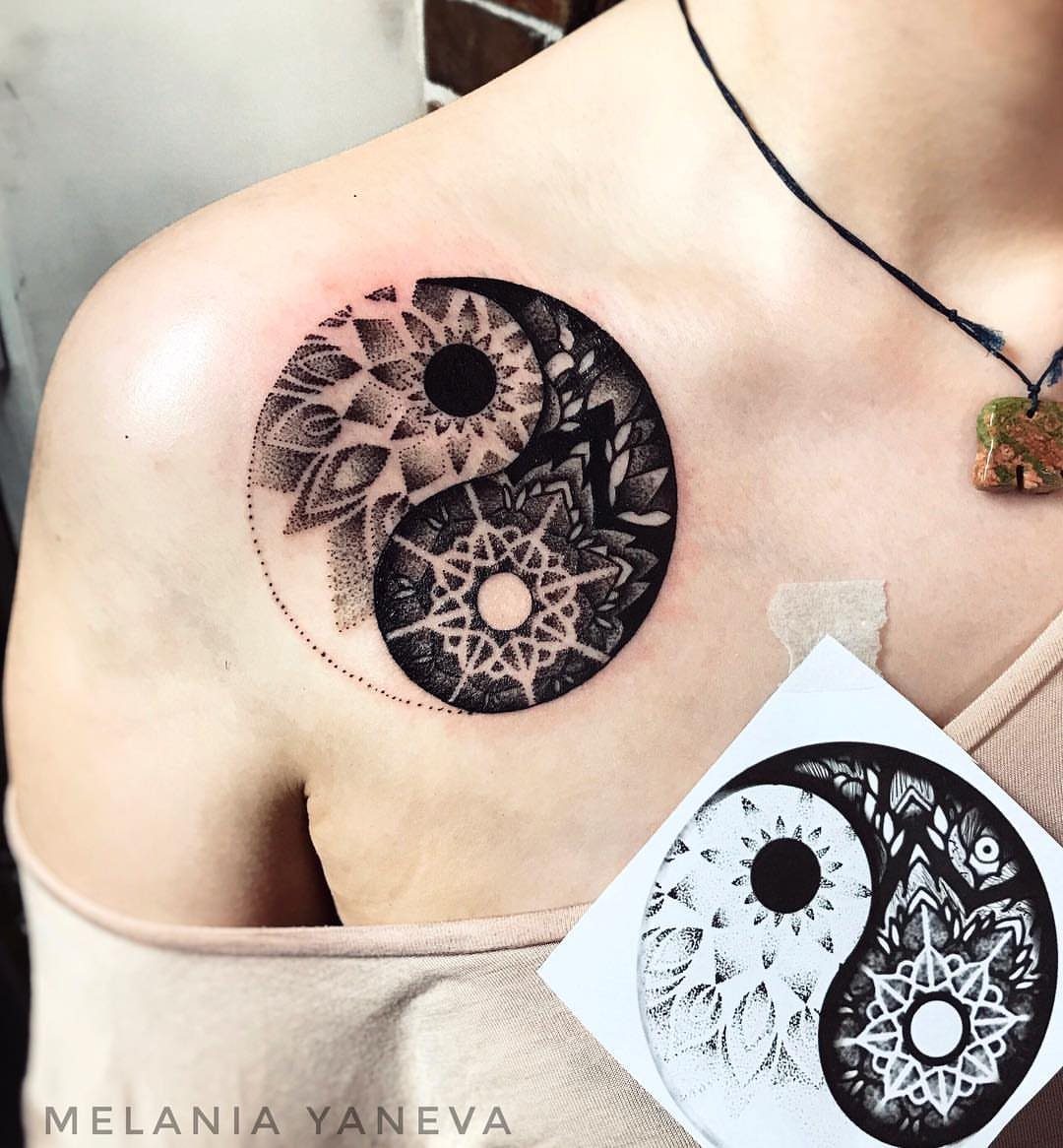
The yin yang shape carries enough cultural weight that mandala dotwork almost feels necessary; it turns a symbol into a specific piece. Without that layer, I see too many of these done small and blurry.
Shoulder placement suits the round form, but the collarbone area swells and heals unevenly. I would plan for 2 sessions or accept that the first pass will need refinement once the skin settles.
Black ink holds the dotwork detail better than color, and the geometry means any migration of ink over years will show. Go bigger than you think, or simplify the pattern.

【ELEGANT FLORAL ARTWORK】 Features 16 unique sheets combining classic balance symbolism with intricate monochrome floral garlands, roses, and botanical elements for a sophisticated, modern body art aesthetic

[Semi-Permanent, Realistic Tattoos] INKARTLINK semi-permanent tattoos are lifelike, durable, waterproof, and sweat-resistant, lasting 7–14 days and gradually fading as the skin’s outer layer sheds. They’re perfect for everyday wear, events, or themed occasions. From the beach to the office, they stay vibrant, allowing you to effortlessly showcase your body art in any setting.

FUN TATTOOS - Enjoy this fun sheet of temporary tattoos that can be applied on skin or used as a waterslide decal on a variety of surfaces. Temporary tattoos are great for party favors, events, costumes and dress-up, permanent tattoo testing or just for fun.
4. Flame and Water Tattoos
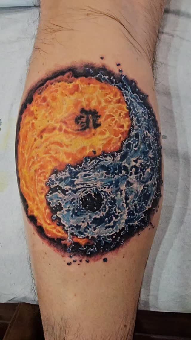
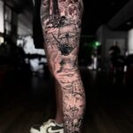
4 hours is a long sit for a lower leg piece, and the color saturation in the flame-and-water yin yang shows where the time went.
Orange and blue both fade toward muddy brown if the saturation is not pushed, so the maker’s investment in solid packing makes sense.
Chinese characters inside the symbol add a personal layer, but I would verify the translation independently. The tattoo reads as balance regardless; the text is for you, not the viewer.
Yin yang forms suit arms and legs because the shape wraps muscle movement well. A circle on a flat back loses something; on a calf or forearm, the body completes the idea.

Realistic Red & Yellow Flame Design – 6 large sheets of Halloween temporary tattoos featuring vibrant, fiery flame shapes, perfect for creating a hot, horror-inspired look for Halloween or cosplay.

Personalized Decoration: These vinyl stickers feature a vibrant and personalized flame pattern design, with bright colors and clear patterns that stand out. They are an ideal choice for teenagers and adults to decorate items and showcase their personalized designs, which can attract attention and stand out.

Long Sleeves,O-Neck with Hat,Hood Sweatshirt,Front Big Pocket,Without Fleece&Velvet,Novelty Fashion 3D Pattern Printing Hoodies,Many Creative Graphic Pattern
5. Matching Sword Tattoos
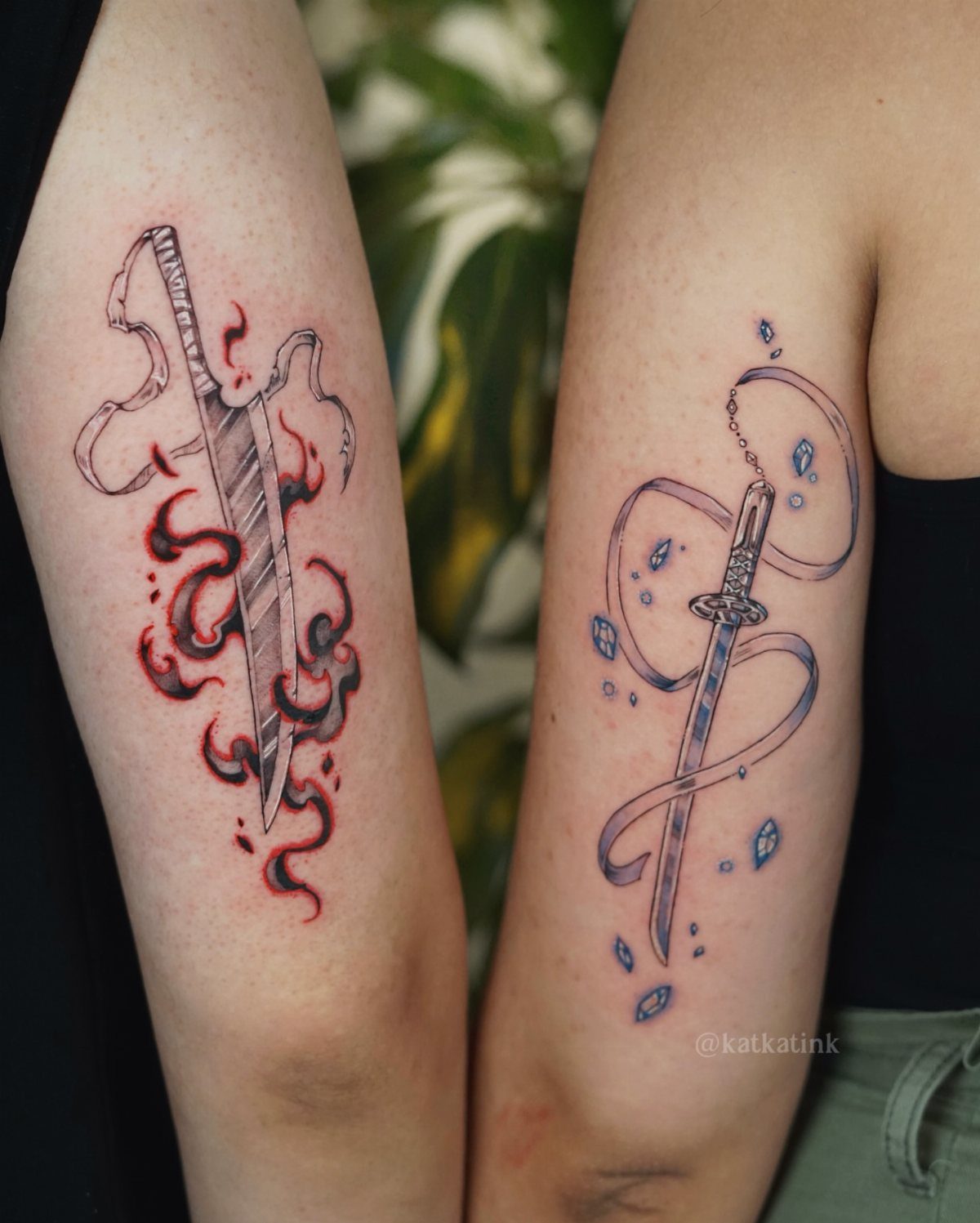
Sword pairings work when each blade carries its own element so clearly that the match is obvious at a glance.
Sun and moon entwined with blades is a variation I would consider if the anime reference does not suit both people. One sword with a crescent, one with a solar disk, keeps the duality without requiring shared fandom.
Fine line wings and serpents need a steady hand and a large enough scale. These details close up to noise under an inch, so plan for at least palm-sized if you want the ribbons readable.

YIN YANG KOI FISH ART: Features a stunningly balanced composition of two twin koi fish swimming in a circular motion, beautifully embodying the traditional spiritual symbol of Yin and Yang. This fluid aquatic motif is crafted using a digital hand-drawn fine line tattoo ensures crisp lines and flawless gradient shading to elegantly capture the sweeping gossamer fins, delicate fish scales, and realistic smoky ink trails with perfect artistic grace.

Japanese Koi fish yin yang inspired design featuring two koi fish floating in a circle around a yin yang symbol.

YIN YANG KOI FISH & JAPANESE WAVES: Two koi fish circle into a Yin Yang symbol, framed by sweeping Japanese-inspired waves and water currents. Fine-line fish details contrast with bold black wave sections to create a balanced armband design.
6. Koi Fish Tattoos
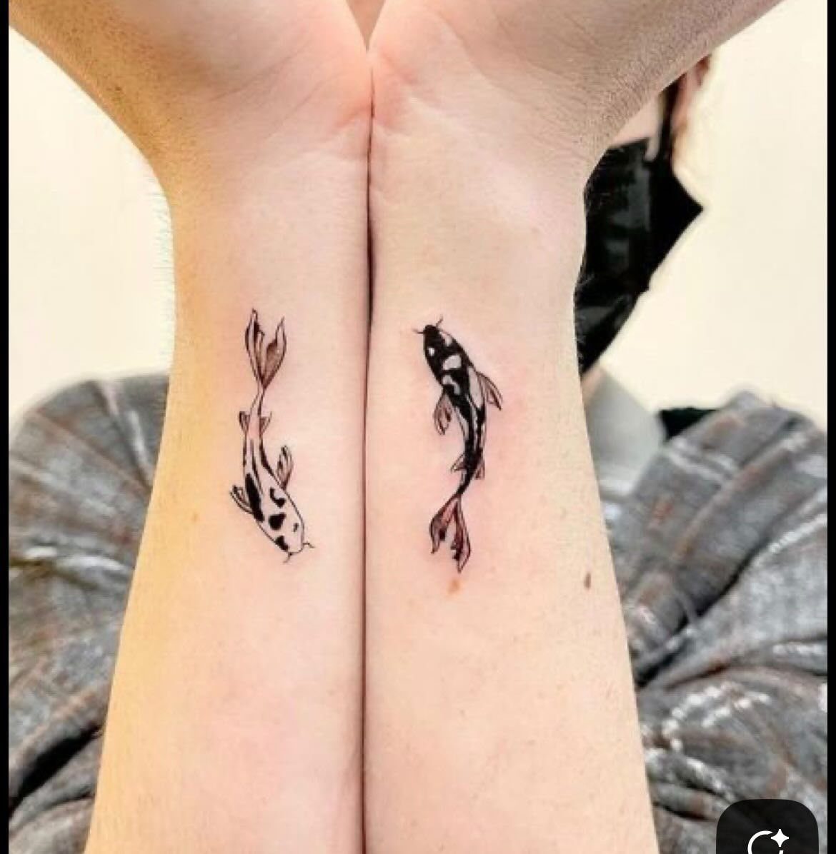
White koi against black, one per wrist: the fish read as individuals first, a pair second, which is the right order for matching tattoos. Too many designs force the connection and lose the character.
The inner wrist is a painful, high-movement spot that fades fast. These small pieces will need touch-ups, so budget for that or choose a less mobile area like the upper forearm.
Color koi carry more symbolic weight in Japanese tradition, but a black and white version suits the opposite theme directly.
Red and blue work as a variation, though the larger scale that color demands changes the commitment significantly.

CELESTIAL SUN AND MOON ART: Features a beautiful symbolic pairing of the cosmos across two independent sheets: one showcasing a radiant, flaming sunburst and the other depicting an ornate bohemian crescent moon flanked by geometric lines. This mystical motif is crafted using a digital hand-drawn fine line tattoo ensures crisp lines to keep the delicate starburst sparkles, fine dots, and long vertical alignment lines perfectly sharp and elegant.

[Tattoos Stencils Kit]: 40 sheets Ramadan style tattoo stencils featuring moon,star, butterfly,floral,lamp design. Enough quantity and different pattern for you unleash your creativity and adorn yourself with beautiful henna designs. Variety of options to meet your every need.

Moon Phases Stencil: You will receive 1 pc moon phases pattern stencil. Reusable DIY plastic stencil that can bring fun to your daily DIY projects, perfect for moon phases enthusiasts for house decorating! add a splash of color to your life. Please note: This product is intended for ages 14 and above.
7. Opposite Character Tattoos
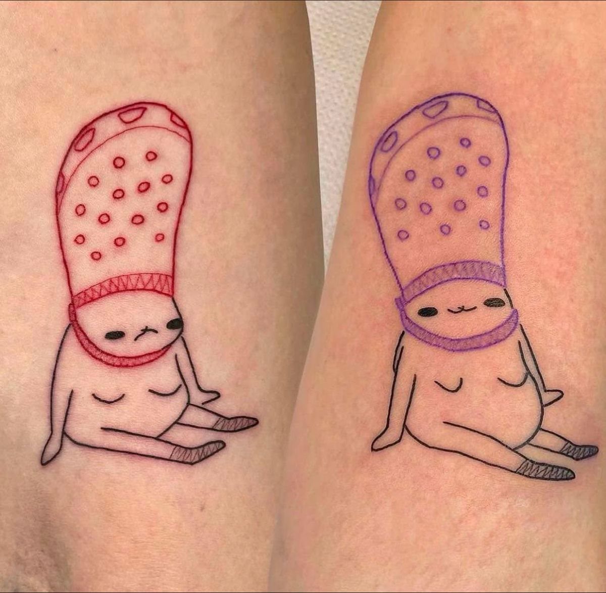
Red ink for a frown and purple for a grin: the color split does more work than the expression alone. These 2 small figures read as opposites because the palette separates them before the face does.
The line art style keeps them legible at the size most friends actually commit to, which is rarely larger than a palm. A small tattoo is enough for the Crocs-as-hat joke to land.
I would place these where you can see your own but not the other person’s, so the pair exists only when you are together.
Inner forearm, maybe, or the side of the calf. The humor depends on reunion; the tattoo should force it.

[Semi-Permanent, Realistic Tattoos] INKARTLINK semi-permanent tattoos are lifelike, durable, waterproof, and sweat-resistant, lasting 7–14 days and gradually fading as the skin’s outer layer sheds. They’re perfect for everyday wear, events, or themed occasions. From the beach to the office, they stay vibrant, allowing you to effortlessly showcase your body art in any setting.

[Massive 96-Piece Value Pack] Includes 8 sheets of vibrantly colored tropical bird and hummingbird temporary tattoos. Measuring 6.3 inch x 4.7 inch per sheet, these pre-cut designs offer endless fun for kids and adults alike. An affordable bulk back to school essential under $10, featuring easy to use pre-cut tattoos that make perfect classroom rewards and provide enough fun for up to 3 classrooms.

🎁【Colorful Flower Bird Themed Tattoos for Kids】Flower Bird tattoos for kids, Use them as party favors and your kids will love. Perfect for flower bird themed party, birthday activities, school reward and other class events. They will be your kids' favorite small gifts.
8. Contrasting Dagger Tattoos
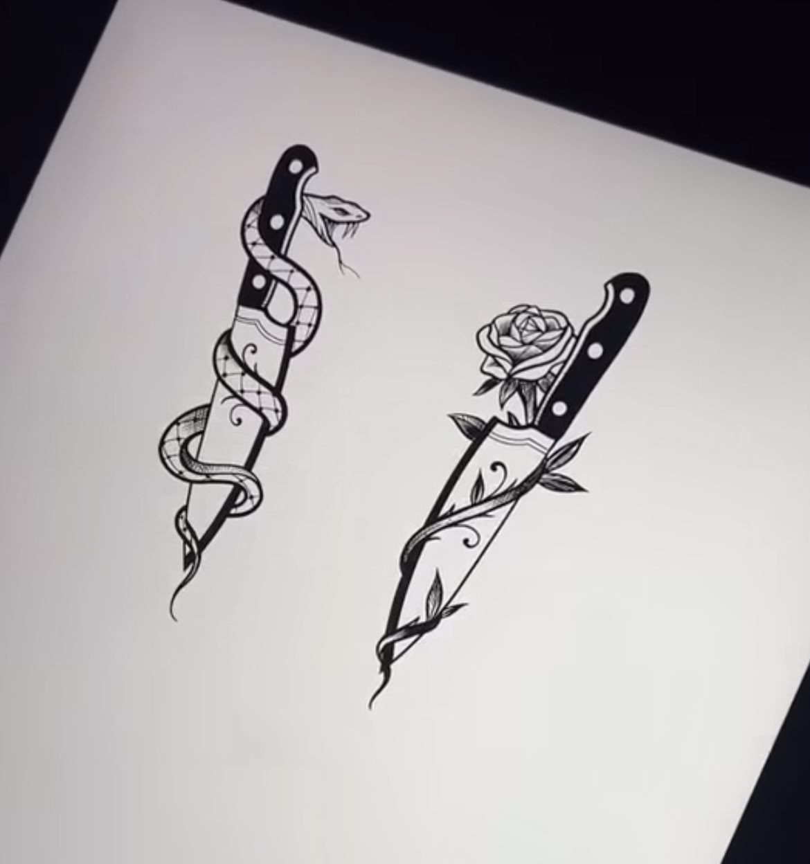
A snake and a rose vine carry opposite meanings without needing explanation, which matters when the tattoo is a matching set with someone whose taste you only partly share.
Flash art gives you a finished design to evaluate before any commitment, not a concept to imagine.
Check that the snake’s scales and the rose petals both hold at the size you want; fine detail in black ink closes up faster than most people expect.
I would ask for the snake blade slightly thicker in line weight so both tattoos age at roughly the same rate. Matching sets look mismatched down the line when one was done delicate and the other bold.

🐙4 Sheets Unique Groovy India Black Temporary Tattoos Sticker:🐠 There Are 4 Sheets Tribal Temporary Tattoos For Women Adults 21x15cm 8.2"x5.9" Including Various Popular Designs Round Lace Hands Boho Bohemia Geometry Lotus Mandala Flower Florals Tatoos Stencils Template.

FUN TATTOOS - Enjoy this fun sheet of temporary tattoos that can be applied on skin or used as a waterslide decal on a variety of surfaces. Temporary tattoos are great for party favors, events, costumes and dress-up, permanent tattoo testing or just for fun.

✨ MASSIVE 96-PIECE VALUE PACK: Includes 8 sheets (6.3 inch x 4.7 inch) of vibrant Mandala & Rangoli designs. Perfectly pre-cut and ready to use, ensuring enough super cute tattoos for the entire classroom or party! An affordable bulk back to school essential under $10, featuring easy to use pre-cut tattoos that make perfect classroom rewards and provide enough fun for up to 3 classrooms.
9. Watercolor Wolf Tattoos
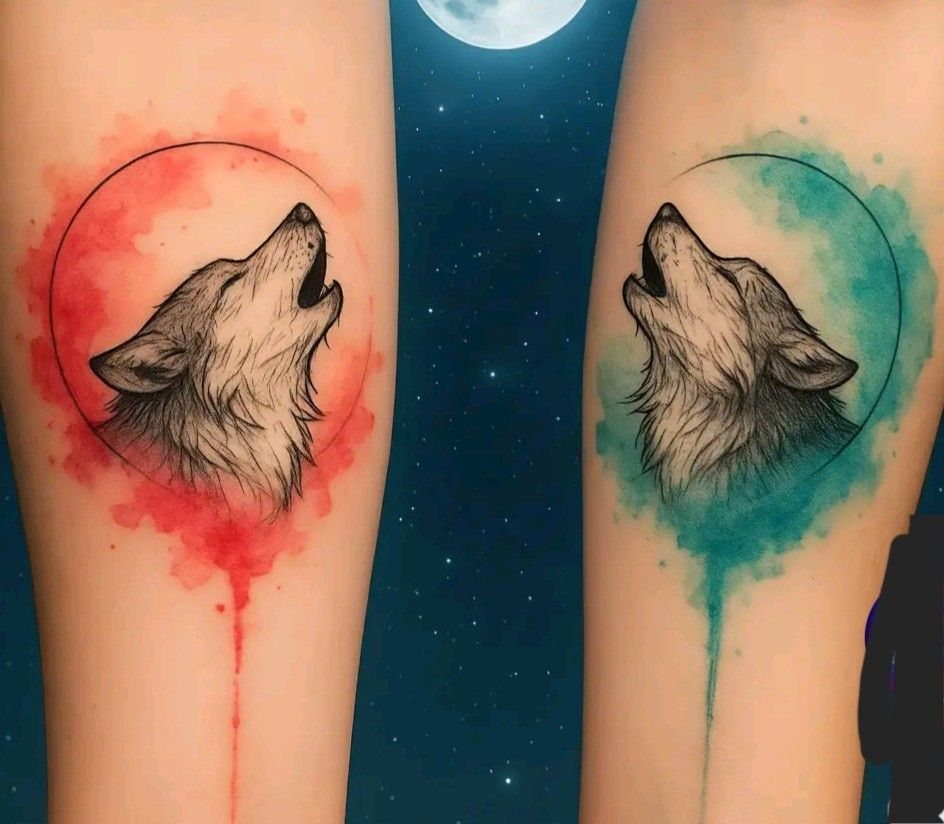
Watercolor backgrounds bleed and fade; the wolf inside the circle is what remains later, so make sure the silhouette stands on its own without the red or teal behind it.
The circular frame helps, concentrating the eye on the profile. I would keep that frame in solid black even if the background washes out, since the geometry holds the composition together.
These suit arms placed side by side, the mirror effect completing the idea. A single watercolor wolf on its own reads as nature imagery; the pair with opposite color fields reads as relationship, which is the point of the search.


6 SHEETS FLAME DESIGN: This set includes 6 sheets of flame temporary tattoos with fiery burn effects and realistic burn mark details; Features vivid red/orange fire patterns, classic flame shapes and gradient designs

Star Sun Stickers for Nail Art: You will get 9 Sheets star sun 3D 5D nail stickers, self-adhesive nail design, with sun, stars, moon different patterns to provide you with a variety of choices, allowing you to create your own unique nail art.
Meaning of Matching Tattoos
A matching tattoo only works if both people still want the same meaning years later. The bond it represents needs to outlast whatever style trend made the design appealing in the first place.
Unity sounds simple until one of you moves cities or the friendship shifts. I would avoid any text that names a specific year or uses "forever" language; the tattoo lasts, the circumstance might not.
Shared experience carries more weight than shared symbolism.
People who sat through the same long session, same pain, same healing phase, already have the story whether the imagery matches perfectly or not. The ink just marks the occasion.
If the relationship ends, a well-designed opposite tattoo still functions as a standalone piece. That is worth planning for from the start.

Koi Fish Yin Yang Design: This semi-permanent temporary tattoos pack holds 2 sheets featuring realistic koi fish circling in a yin yang formation with flowing water details. Koi fish symbolize perseverance, strength, and good fortune; yin yang represents harmony and duality in life. Realistic aquatic execution creates meaningful body art for those drawn to Eastern symbolism. Ideal for arm, wrist, or ankle.
Placement Ideas
Wrist placement shows in every handshake and photo, which is the point for matching sets, but the inner wrist moves constantly and fades fast.
Budget for touch-ups every few years or choose the outer wrist where the skin holds ink longer.
Ankle tattoos heal slowly; shoes rub and socks stick. Aftercare takes real commitment in the early weeks, more than most people expect from such a small piece.
Forearms let you see your own without a mirror, which matters for meaning you want to revisit. They also hide under a long sleeve when the occasion calls for it.
I would avoid ribs or spine for a first matching set. The pain is sharper, the healing awkward, and you cannot check the work yourself during recovery.
Design Styles
Minimalist line art ages better than detailed illustration at small sizes. A single needle drawing of a sun keeps its shape where a shaded version blurs to gray soup by year five.
Color demands more skin real estate.
A watercolor wash needs room to breathe; compressed too small, it becomes mud. Black and red or black and blue stay legible where full spectrum fades unevenly.
Geometric styles suit the opposite theme directly. Clean circles, straight divisions, mirrored shapes: the style is the concept, which saves the design from needing explanation.
I would match style to the person’s existing work if they have any.