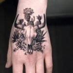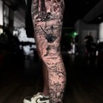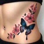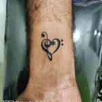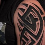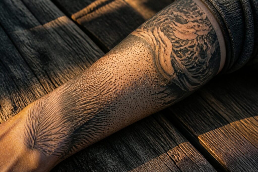
Tattoo pattern texture ranges from single-needle featherwork that fades like actual plumage to packed dotwork that shifts from solid black to gray as you move.
The deciding factor is not style but scale and placement. A 2-inch rust patch on a wrist reads as skin condition; across a shoulder, it becomes deliberate armor.
1. Rugged Textures
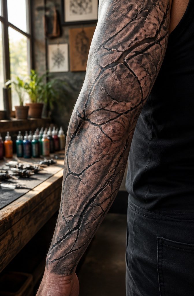
Rough stone and weathered bark carry a visual weight that flat color simply cannot match.
A tattoo built from these rugged textures reads as something that has already survived time, which is exactly why people choose them for sleeves, chest pieces, or full backs where the scale lets the detail breathe.
The stone approach works best when the artist layers gray washes with deep black cracks, mimicking how ancient monuments fracture rather than chip cleanly.
I have seen this done as a Zbruch idol, the weathered surface making the Slavic underworld figure feel genuinely unearthed.
Bark texture demands a different hand, using fine parallel lines and occasional knots to suggest tree growth rather than drawing every groove.
Totem designs stack animal faces into this carved-wood effect, the stacked format giving each layer its own grain direction.
Rust and scar-like patterns push the same idea toward something more bodily. Rust brings orange-brown oxidation spots against iron gray, a color combination that ages well because it already looks aged.
Scar tissue rendered in raised white or pink against darker surrounding skin creates the illusion of prior damage survived, though this requires a steady hand to avoid reading as accidental blowout.
The communication is straightforward: strength through endurance, not strength through force. These textures say the bearer has been weathered and remained standing.
Placement matters because the effect collapses at small scale; a 2-inch rust patch on a wrist looks like a skin condition, while the same texture spread across a shoulder reads as deliberate armor.

Poseidon cartridge adopt a one-time joint design hygienic standard The material is stainless steel and easy to color,and has better ink flow

Complete Packaging: 50pcs mixed size tattoo cartridge needles set, includes 5pcs each of 1205RL 1207RL 1209RL 1205RS 1207RS 1209RS 1207RM 1207M1 1215M1 1215RM. The unique design of the needle can store more ink, and the sharp needle thread better completes tattoo activities, suitable for both professional tattoo artists and beginners.

PACKAGE INCLUDING - 50PCS mixed size tattoo cartridges set, includes 5PCS each of 3RL, 5RL, 7RL, 9RL, 5RS, 7RS, 9RS, 9RM, 11RM, 7M1. OFEYLE tattoo cartridge needles are each needle is individually packed and sterilized with 100% EO gas, much safer and more convenient, so you can focus on creating art with complete confidence
2. Soft Textures
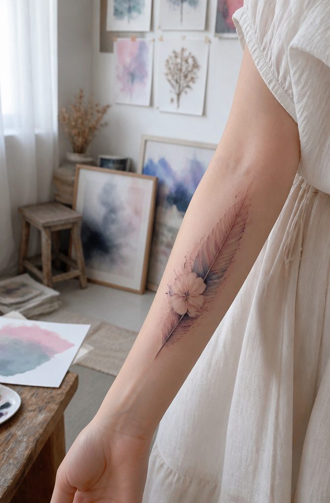
Soft textures in tattoo work borrow from fabric, feather, and watercolor traditions to create something that reads as touchable rather than armored.
The needle moves in ways that mimic how silk pools or how down frays at the edge, building a surface that suggests gentleness without demanding it.
Feather edges need the lightest single-needle work, almost no pressure, with the artist pulling back before the line would turn hard. Done right, the pigment fades like actual plumage where barbs thin to nothing.
Watercolor washes layer translucent passes so the skin itself becomes the paper, the bloom spreading where water carried it. Fabric textures, linen or chiffon, rely on directional stippling that follows a weave pattern too loose to read as chainmail.
The risk with all three is time. Soft textures blur faster than bold lines because the contrast is already low, and sun or poor aftercare turns a whisper into a bruise.
Placement matters more here than with aggressive work: inner forearm, collarbone, or ribs, where the body curves and the eye expects delicacy. Put a watercolor wash on a calf built for bold geometry and it looks apologetic, not tender.
Artists who specialize in this often come from illustration backgrounds rather than street shop traditions, and their books show more gallery work than flash sheets.
The consultation runs longer because the texture has to match your actual skin tone; what reads as blush on pale skin disappears on deeper pigment without darker anchor points added underneath.
Cost runs higher for the same size, more passes, more time under the needle. The result, though, ages as something you chose rather than something you settled for.

Cartridge Needles Sizes: 20 pcs tattoo cartridge needles include 3RL 5RL 5RM 7RM, each size has 5pcs. Those tattoo needles can be used for lining and shading, which can assist you with the entire tattoo work

【50PCS Mixed Tattoo Cartridge Needles Set】Includes 50 individually packaged tattoo cartridge needles in popular configurations: 1203RL, 1205RL, 1207RL tattoo cartridges, 1209RL, 1205RS, 1207RS, 1207M1, 1215M1, 1209RM, 1215RM (5pcs each). Suitable for both lining and shading needles for tattooing.

Dragonhawk Tattoo Needles: High-quality tattoo needles, manufactured under the trusted Dragonhawk brand, are perfect for all-purpose work. With a polished, long taper design, these needles ensure reliable performance and excellent control.
3. Complex Depth Textures
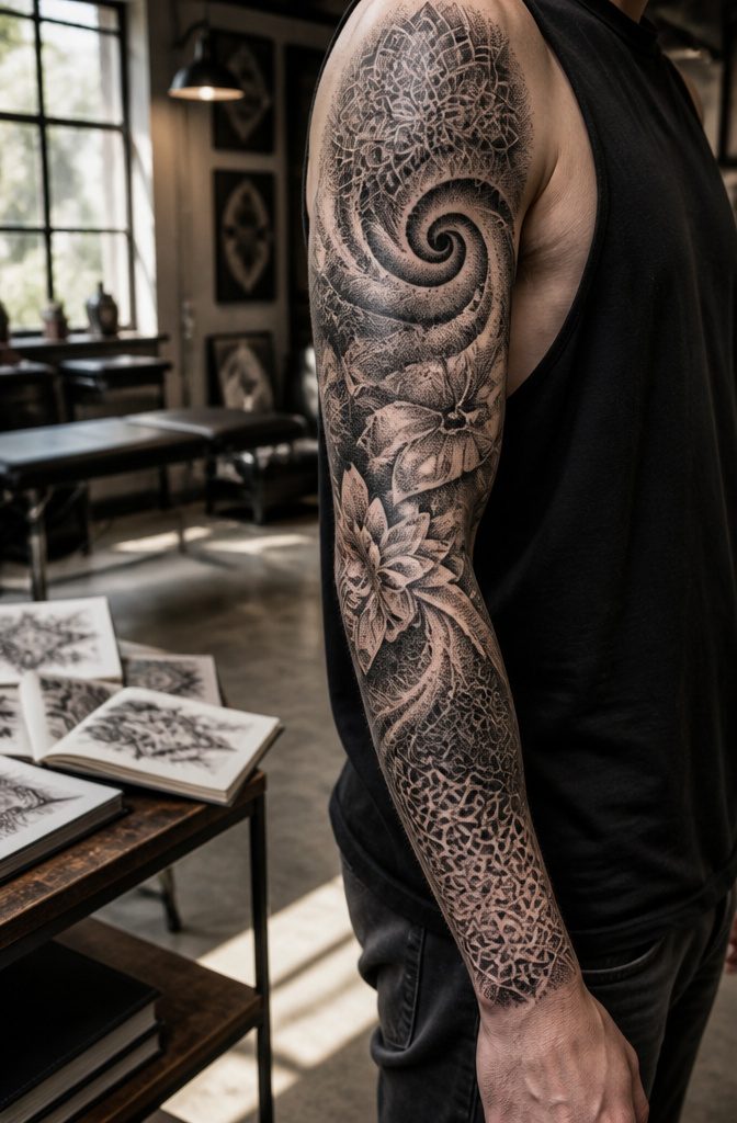
Dense dotwork and stippling build depth by making your eye do the work. Thousands of tiny points cluster tighter in shadowed zones and scatter where light would hit, so the skin reads as carved rather than flat.
I have watched artists spend three sessions on a single sleeve this way, and the result shifts when you move: what looked like solid black from one angle opens into gray from another.
Interwoven line work does something similar with thread instead of dust. Celtic knots, braided geometries, or freehand scribble patterns layer over themselves until the negative space becomes the image.
Variation in line weight does the work; identical thickness everywhere reads as wallpaper, but a hair-thin strand crossing a bold one creates instant recession.
These pieces rarely need a central figure. The complexity itself becomes the subject, which is why they hold up on broad canvases like backs or thighs where a small icon would vanish.
Pain runs moderate to high depending on density; stippling feels like repetitive scratching, while packed linework burns more in the final hours as skin swells. Healing stays straightforward if you keep ointment thin, too much and the dots blur together.
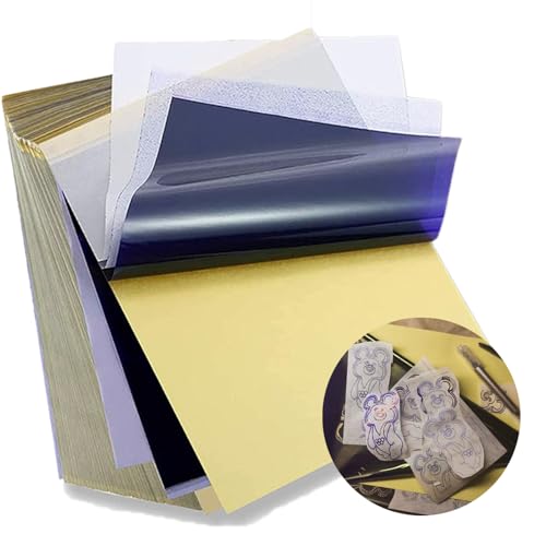
Standard size: Tattoo Transfer Paper is standard A4 paper size, each measures 8.27 in X 11.69 in. There are 4 levels in total. The thickness of the paper is very light and smooth to the touch.

Spirit Tattoo Classic Thermal Transfer Paper, 8.5” X11” (100 Sheets): Established since 1946, the original and trusted choice of tattoo artists globally, offering reliability and consistency in tattoo stencil creation.

Warm Tips: The tattoo transfer paper need to work with transfer medias.You will need to purchase the stencil ointment separately. Apply the design made on the master paper. Please pay attention to press the back side of the pattern to the skin for at least 3 seconds
4. Textured Lettering
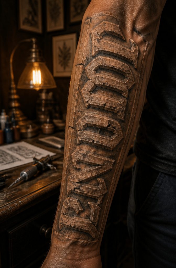
Carved stone, stitched leather, burned wood, or corroded metal can turn the letters themselves into the story rather than dressing up plain text.
The texture becomes the message: a name in cracked limestone reads as memorial, not just namesake. A phrase in scorched grain suggests something survived the fire.
Keeping the letterforms readable at tattoo scale takes real care. I have seen beautiful burned-wood scripts where the charring swallowed the thinner strokes entirely, leaving a black blob by year three.
Stone carving works better when the cracks are drawn wider than real stone would allow, because skin spreads and softens edges over time.
Metal corrosion needs contrast between the rust tone and the base; too close and it all muddies together.
Placement matters more with textured lettering than with clean fonts.
A corroded metal word on a forearm catches light differently in every photo, which is part of the appeal, but the same piece on a ribcage spends most of its life in soft shadow where the corrosion just looks dirty.
The back of the calf or the outer upper arm gives enough flat plane and enough light variation for the texture to actually read.
Cost runs higher because these pieces demand an artist who understands how pigment cools as it heals.
That warm rust brown you chose fresh will settle 20 percent darker. The artist has to compensate in the moment, and not every shop has someone who does that confidently.

MADE IN THE USA SINCE 1990: For over 30 years Dynamic Color has produced professional tattoo ink in the United States, an established American brand artists built their work on long before most imported labels existed.

Everything you need in one professional kit: True Black, Dark Black, Grey Wash, Bright White, Fire Red, Royal Blue, Bright Yellow, True Green, Venetian Brown, Robins Egg Blue, plus 8 more versatile shades. Covers black & grey realism, American traditional, portraits, neo-traditional and watercolor styles — no need to buy extra colors.
5. Nature Textures
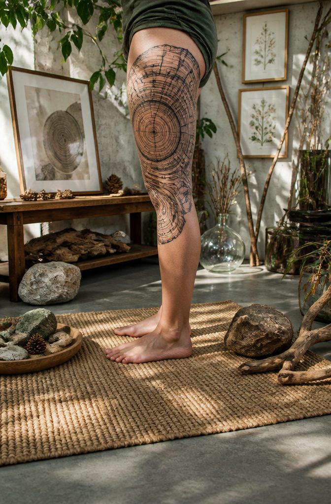
Tree rings make a solid forearm piece because the eye reads them as both a cross-section of real wood and a map of elapsed years.
The same pattern shifts from botanical record to metaphor depending on whether the artist keeps the lines tight and scientific or lets them wander and crack.
Cloud formations work similarly. A cumulus stack rendered in soft dotwork reads as sky; the same shapes packed with heavy black shading turn into smoke or storm, something more emotional than meteorological.
Rock strata and leaf venation reward placement on larger areas where the pattern can stretch.
The spine, the thigh, the ribs: these give the lines room to follow the body’s own topography. Strata tattoos that follow a muscle’s grain look intentional; ones that fight it look like a sticker.
Wave patterns probably show up most often as sleeves or side pieces, partly because the motion needs horizontal space to read as water rather than static curves.
The symbolic weight is already built in. Rings mean time, waves mean change, stone means endurance.
The tattoo does not have to announce this; the material does the work if the execution is honest. A tree ring piece with counted bands and realistic pith carries that meaning without a caption.
One that stylizes the rings into perfect concentric circles loses the organic reference and becomes geometry with a nature hint, which is a different category entirely.

Cool Light Brown Tattoo Ink - Taupe delivers a cool-toned hue, ideal for permanent eyebrow dye applications, especially on lighter skin tones.

Microblading Ink - This is a neutral skin pigment tattoo ink shade, that can be used for areola or for skin corrections.

Cool-Toned Tattoo Pigment Kit - Designed for cosmetic professionals, this curated mini set includes high-performance tattoo inks ideal for neutralizing warm undertones and achieving natural, healed eyebrow color.
6. Abstract and Geometric Textures
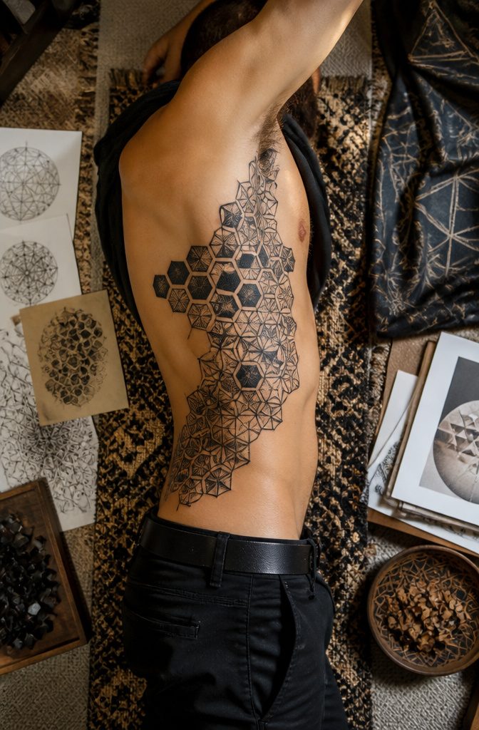
Abstract and geometric textures build visual weight through repetition rather than imagery. A grid or tessellation holds its shape for decades because the eye reads the pattern, not the line quality.
Fractal branching works the same way; each split is a predictable rule, so minor spreading or fading just softens the math instead of breaking a picture.
Optical interference patterns, the kind that seem to vibrate or shift as you move, are trickier. They rely on extremely precise spacing, and even slight blur can collapse the illusion into muddy noise.
Figurative work ages through recognizable details going soft: a face loses an eye, a flower petal bleeds into the next.
Non-representational patterns age through contrast loss. High-contrast geometry has fewer places to fail, which is a relief.
A solid black hexagon against skin tone still reads as a hexagon when the edges feather slightly. Placement is where it gets tricky.
Ribs, inner bicep, or anywhere skin stretches and compresses will distort a rigid grid in ways that organic textures forgive. If you want geometric texture somewhere mobile, looser tessellations or broken grids handle movement better than tight Euclidean precision.

Package: 50pcs mixed tattoo cartridge needles, includes 10pcs each of 1203RL, 1205RL, 1207RL, 1209RL, 1211RL.

Mast Pro purple tattoo cartridges needles have been providing with high density clear plastic body.

1.HIGH QUALITY:The needles are 316L stainless steel. All the needles are packed in a separate package. The needles are made of high-quality 304 stainless steel and are beautifully polished and easy to clean
7. Cultural and Symbolic Textures
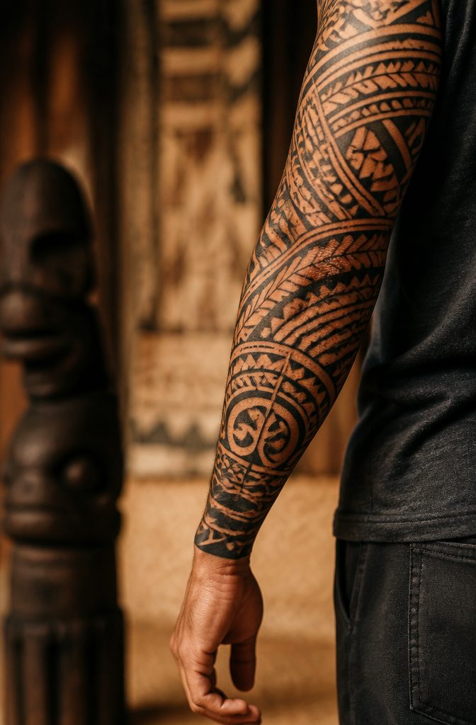
Some pattern textures carry weight far beyond how they look, and that is exactly why they need care.
A sleeve built from Polynesian tapa cloth geometry or the carved marks on a totem pole does not read as decoration to the people it came from; it reads as lineage, status, or spiritual protection.
The texture of the pattern, the rhythm of the repeated forms, is the meaning.
Buddhist mandala construction works the same way: the concentric layers are not a background, they are a map, and getting the proportions wrong is not a minor flaw. It breaks the thing.
I have watched artists spend hours on beaded patterns lifted from Indigenous regalia, treating the texture as a visual effect while missing that each color and stitch position carries specific clan or ceremonial significance.
The result might photograph well, but it is a costume, not a tattoo. If the pattern is not from your lineage, the respectful move is to commission a practitioner who holds that lineage, or to choose a different texture entirely.
The same applies to Maori ta moko or Samoan tatau: the texture is the identity, and wearing it without the right to it is a problem that does not fade with the ink.
This does not mean every cultural texture is off-limits to everyone.
Some traditions welcome adaptation when the relationship is real. The work is finding out which is which, and letting the answer guide the design rather than forcing the design past it.

Medical Sterility & Safety - These tattoo gun needles are crafted from 304 surgical steel and medical plastic, with each single needle tattoo cartridge being EO gas sterilized and individually sealed for hygiene.

PACKAGE INCLUDING: 50pcs mixed size tattoo cartridge needles set, includes 10pcs each of 1203RL 1205RL 1207RL 1209RL 1211RL; The needle edges are specially designed to catch more ink; Great gifts for tattooists and beginners; Wormhole Tattoo cartridge needles are each needle cartridge is individually packed and sealed, much safer and more convenient;
Package includes 10 pieces of each size: 3RL, 5RL, 7RL, 9RL, 3RS, 5RS, 7RS, 9RS, 5M1, 7M1
8. Mandala Textures
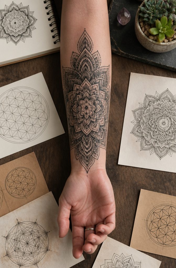
Mandala textures live or die by the space between center and edge.
A flat geometric mandala reads as a symbol; one where line weight thickens and dot density crowds the outer rings reads as something you could almost feel under a thumb.
The second kind is harder to execute and usually worth the extra session time.
The radiating structure gives the artist a built-in map for building texture incrementally. Tight stippling near the core, slightly heavier lines at the first ring, then packed dots or crosshatching that darkens as you move outward.
The eye follows the progression without the artist having to explain it. Line weight should shift gradually; a sudden jump between thin and heavy breaks the illusion entirely.
Geometric purists keep every element at the same depth, which photographs cleanly but sits flat on skin after a few years of sun.
The textured alternative uses the mandala’s symmetry to hide how much variation the artist is actually introducing. One petal might carry twice the dot density of its neighbor, but the radial balance keeps the whole thing from reading as uneven.
Pain levels run moderate to high depending on how close the work sits to bone. The repeated detail work means more needle passes over the same area, and the skin gets irritated faster than with a bold single-pass outline.
Plan for shorter sessions if the design is dense, or expect the last hour to blur together.

Precision Transfer Performance - It’s professional-grade tattoo stencil paper delivers vibrant, high-definition transfers even for intricate designs. The carbon layer ensures sharp outlines without smudging or fading, ensuring crisp lines that stay true to your original artwork.

Precision Transfers & Long Lasting: Tattoo stencil paper delivers vibrant, high-definition transfers even for intricate designs. Creates crisp, dark lines that transfer cleanly to skin (clearly on different skin tones) which are easy to follow during tattooing. The carbon layer made from high-quality dyes ensures sharp outlines without smudging or fading and maintains crisp lines visibility throughout long tattoo sessions, so you can focus on creating art instead of re-drawing lines

Crystal Clear Transfer & Stable Stencil Effect : Our KVM transparent tattoo stencil film delivers sharp, clean printed lines. The pattern transfers perfectly onto skin, not easy to smudge or wipe off after application. It works great for intricate mandalas, skulls, portraits and line art.
9. Animal Textures
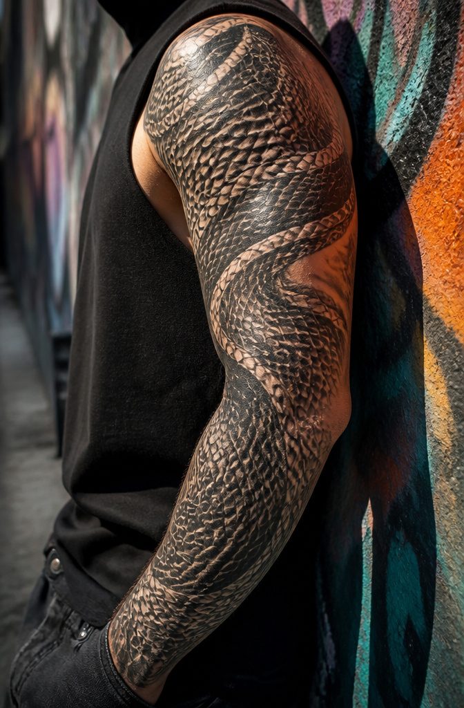
Scales, feathers, fur, and shell patterns carry a tattoo farther than a simple outline of the creature itself.
A snake rendered only in overlapping scalework, each plate catching light at a different angle, reads as more alive than any coiled silhouette.
The same scale density that works across a full forearm becomes noise when crammed into a 2-inch accent between other pieces. Full animal-texture sleeves need negative space around the pattern or the eye tires before it finds the form.
Feather textures demand the same sizing judgment.
Individual barbs drawn too fine blur together inside a year on a busy area like the inner wrist, so artists building a full back piece of plumage can go microscopic, but a feather tucked beside a clock or a name should stay bold enough to hold at a glance.
Fur sits at the other extreme: loose enough strokes to suggest direction and length, tight enough that the patch does not read as static or matted.
Shell patterns, with their radiating lines and growth rings, flatten badly when copied too small.
I have seen a nautilus spiral the size of a quarter lose all its depth inside six months because the artist tried to pack every chamber line in where a simpler curve and shadow would have aged cleaner.
The real choice is whether the texture carries the whole design or supports something else.
Full pieces let the pattern breathe and shift with the body’s movement. Accent pieces borrow the texture for contrast against smoother surrounding work, but the borrow only works when the scale of the texture matches the scale of the space.

MADE IN THE USA SINCE 1990: For over 30 years Dynamic Color has produced professional tattoo ink in the United States, an established American brand artists built their work on long before most imported labels existed.

Premium Ingredients: Tattoo Ink Mixing Solution uses Distilled Water and Hamamelis Water for safe and effective ink mixing
MADE IN THE USA SINCE 1990: For over 30 years Dynamic Color has produced professional tattoo ink in the United States, an established brand artists have built black-and-grey work on long before most imported labels existed.
10. Textured Infinity Symbols
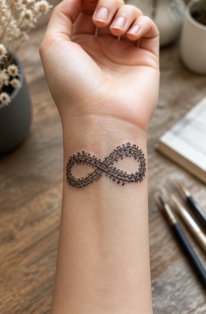
An infinity outline only holds meaning if the line itself holds your eye, and texture is what keeps it there once the novelty of the symbol fades.
Lace worked into the loop turns a math sign into something that reads like fabric against skin, the negative space between threads doing as much work as the ink.
That particular treatment sits best at wrist or collarbone scale, where the delicacy does not collapse into a dark smudge over time.
Barbed wire and chain links push the same shape toward harder readings, protection or binding depending on the wearer.
The links need spacing precise enough that each loop stays distinct; too tight and they merge into a gray band within a few years.
Organic growth, vines or root systems threading the figure, lets the symbol stretch and breathe across a larger placement like a forearm or ribs.
The risk with any of these is overloading a form that already carries weight.
One texture treatment is usually enough; lace and barbed wire do not share the same infinity well. Pick the reading you want, commit to it, and let the line do its job.

Tattoo Ink for Microblading, Brows + Eyeliner - This versatile microblading pigment can be used to tattoo eyebrows or eyeliner. It's recommended for Fitzpatrick 3 - 5, and can be blended with another Perma Blend professional tattoo ink to create your preferred shade.

Microblading Ink - This cool medium/dark brown tattoo ink can be used for permanent eyeliner. Recommended for Fitzpatrick 3-5.

Microblading Ink Set - This contains four of our most popular cosmetic tattoo ink pigments in the shades Dark Forest, Dark Fudge, Blackish Brown, and Blazing Copper Modifier. Used for tattoo makeup application.
What Texture Tattoos Mean
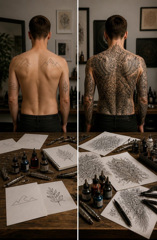
The meaning of a tattoo pattern texture depends entirely on which surface you choose, not on texture as some broad category. Rough, cracked stone or weathered bark reads as strength and resilience, the visual evidence of surviving pressure and time.
That same arm with soft, smooth textures, flowing water or polished marble, signals gentleness, sensitivity, a different kind of presence altogether. Layered, interwoven patterns add complexity and depth, suggesting a person who holds more than shows at first glance.
Placement shapes this too. A back or thigh gives the real estate for intricate, detailed texture work that a wrist simply cannot support.
The larger canvas lets the meaning accumulate across inches of skin rather than compressing into a symbol the size of a quarter.
The shift happens in the specifics. A rugged texture does not mean strength because it is rugged; it means strength because the viewer recognizes cracked earth, scarred hide, the evidence of endurance.
Soft textures carry their own vocabulary through association, not through any rule about texture itself. Pick the surface that matches the story, and the meaning follows naturally.
Where to Place Texture Work
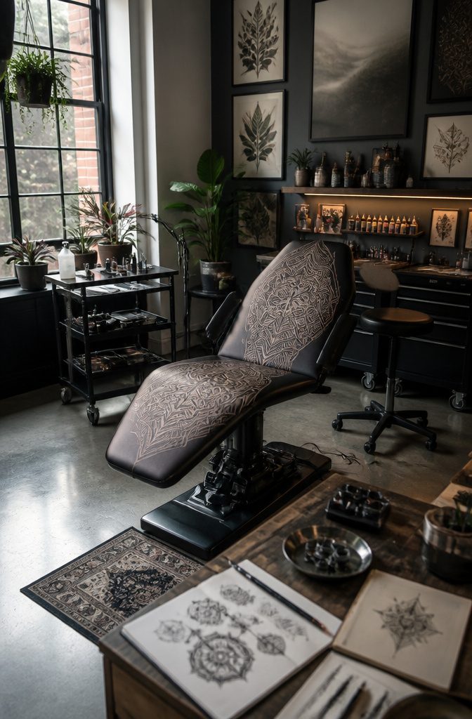
The back and thigh give intricate texture work the room it needs to breathe. A full back piece with layered dotwork or crosshatching can carry detail that would crowd a forearm.
I learned this the hard way with a geometric sleeve that looked dense in the stencil and muddy at six months; the same design, scaled to a thigh, kept every line distinct.
Smaller spots work too, but the texture has to be edited down. A coin-sized patch of wood grain behind the ear reads as an accent, not a landscape.
The curvature matters more than the size. Ribs and shoulders warp flat patterns; a stippled texture that looks even on paper will stretch and compress with every movement.
An experienced artist maps the design to the body’s shape, pulling detail away from the peaks and letting it pool slightly in the valleys.
Any placement is possible if you adjust the density.
What reads as rich texture on a flat stomach needs lighter spacing on a bicep that flexes. The eye fills in the gaps, so the artist can pull back without losing the effect.
Frequently Asked Questions
What do texture tattoos symbolize?
Texture tattoos symbolize strength and resilience when the surface is rough or cracked, like stone or weathered bark. Soft textures such as flowing water or polished marble signal gentleness and sensitivity.
Layered, interwoven patterns suggest complexity and depth. The meaning comes from the specific material association, not texture as an abstract category.
Where should I place a texture tattoo?
The back and thigh give intricate texture work room to breathe and keep lines distinct over time. Smaller spots like behind the ear work for edited-down accents, but curvature matters more than size.
Ribs and shoulders warp flat patterns, so experienced artists map designs to body shape, pulling detail from peaks and letting it pool slightly in valleys.
What is the texture of a tattoo?
A tattoo’s texture refers to the visual and tactile quality the ink creates on skin, mimicking surfaces like stone, fabric, feathers, or wood grain.
Artists build this through needle technique: dotwork for stippled effects, varied line weight for woven patterns, or layered washes for soft gradients. The result reads as a physical surface rather than flat color or clean outline.
How big is a $3,000 tattoo?
Soft textures and detailed lettering already run higher per square inch than bold work due to extra passes and session time.
What are the four types of texture in art?
It organizes tattoo pattern textures by material and effect instead: rugged surfaces like stone and rust, soft surfaces like feather and watercolor, complex depth through dotwork and interwoven line, and symbolic or cultural patterns where the texture itself carries meaning.